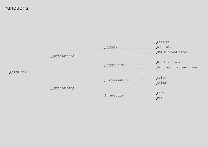
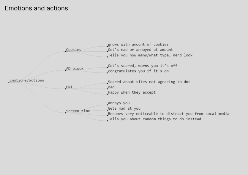
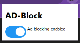
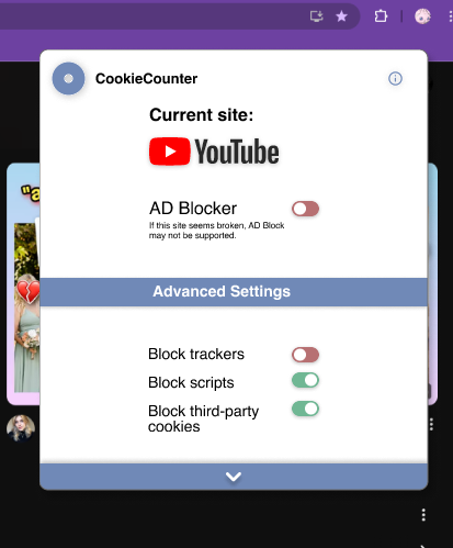
AD-blocker
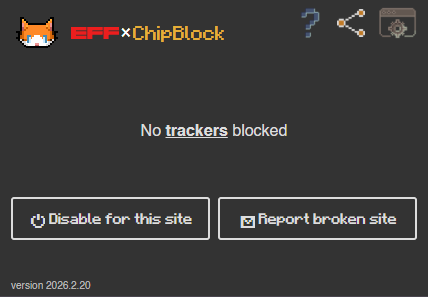
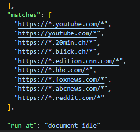
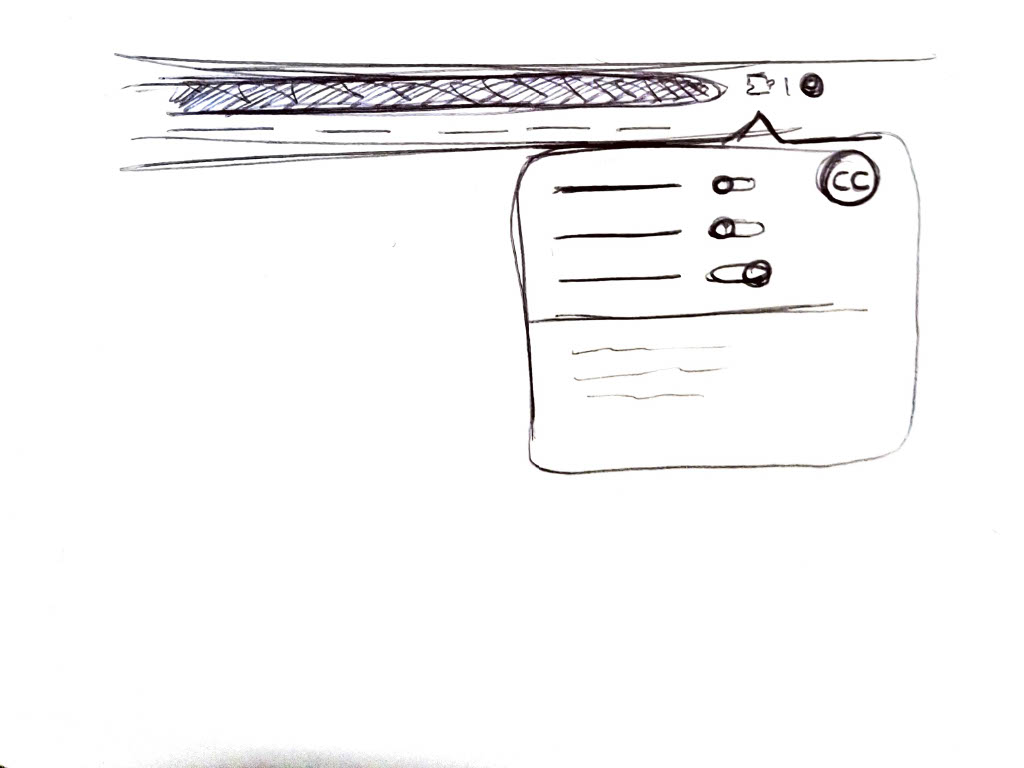
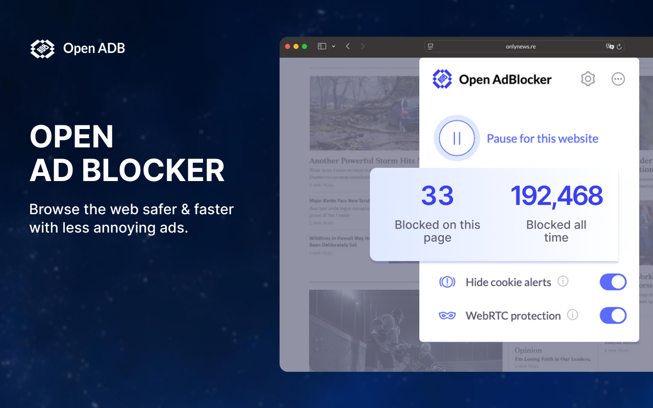
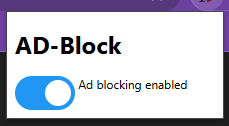
First concept that was later discarded. The ad-blocker wasnt fully designed, though mock-ups were attempted with a simple and clean look inspired by other ad-blockers like uBlock Origin.
Desktop Pet, Character
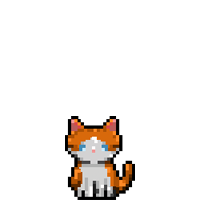
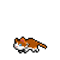
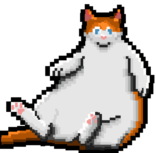
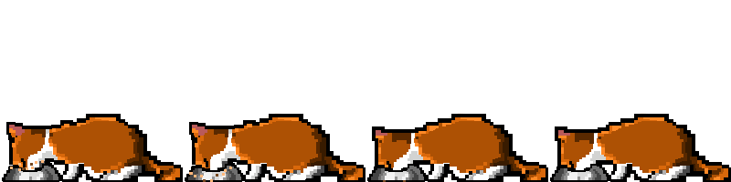
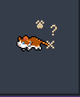
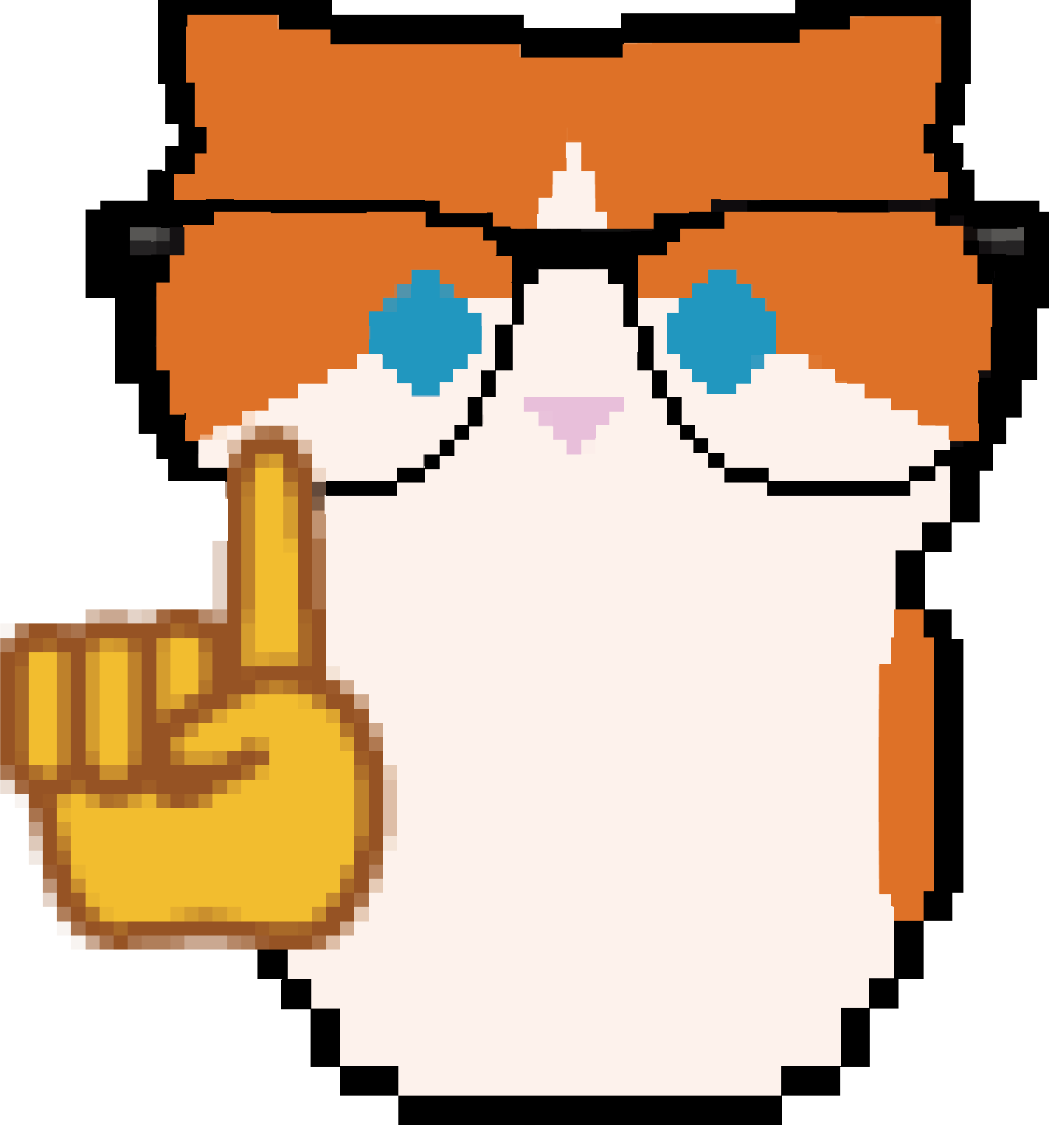
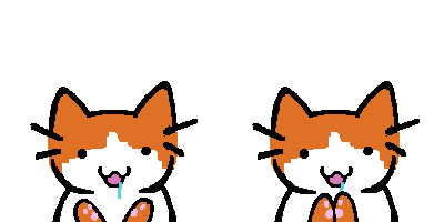
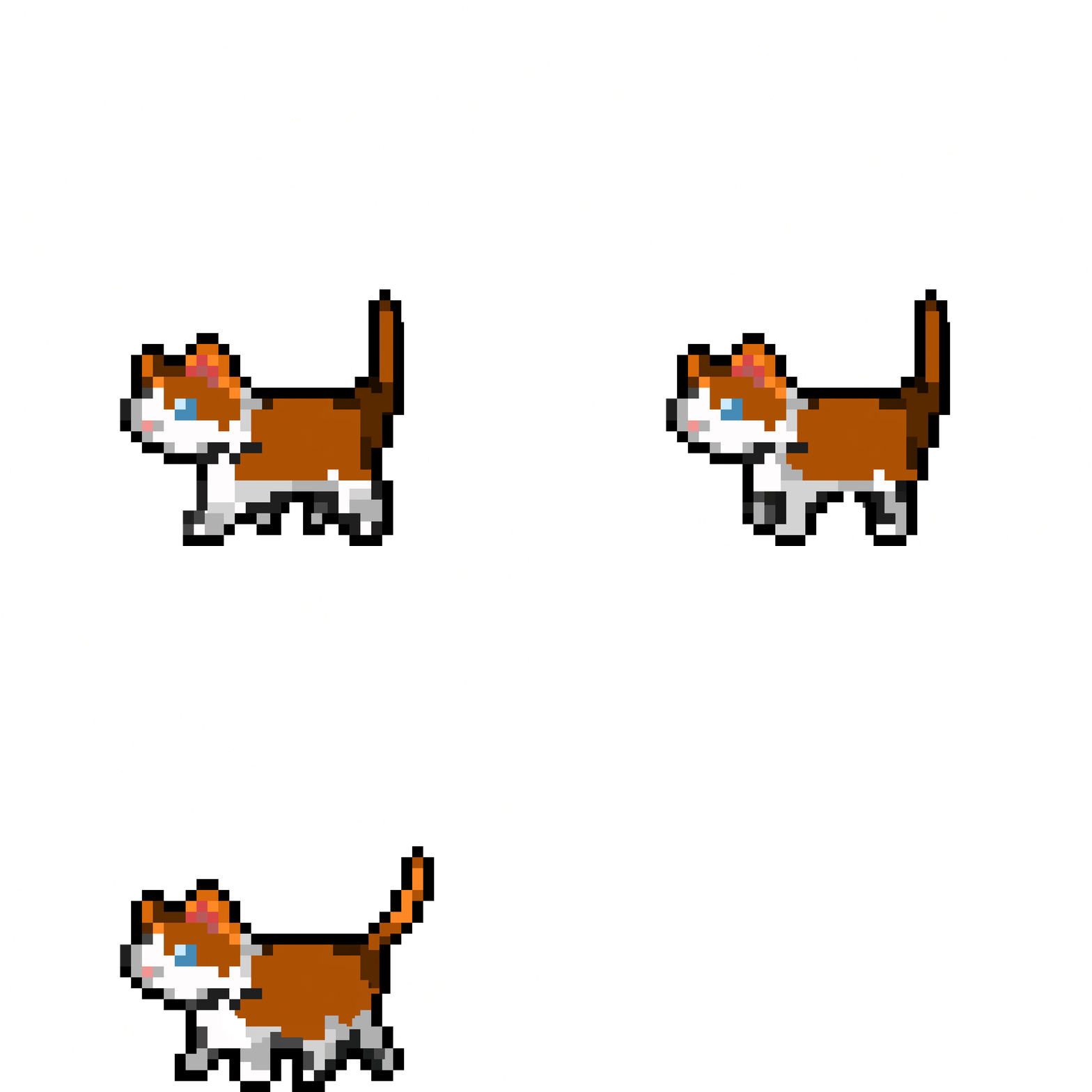
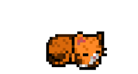
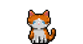
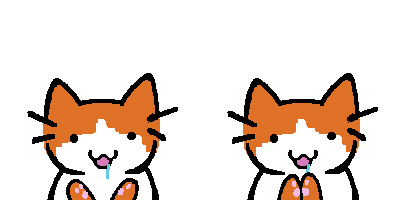
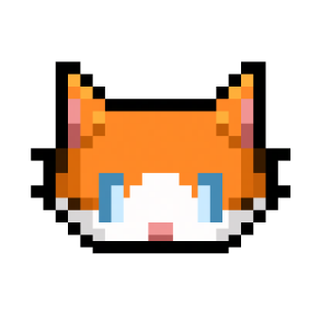
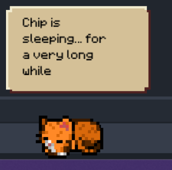
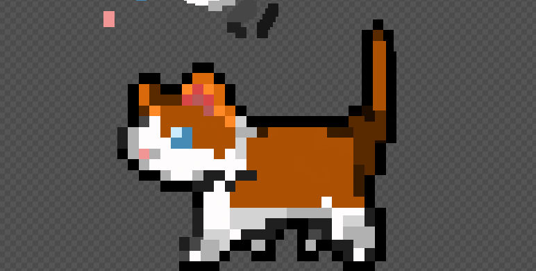
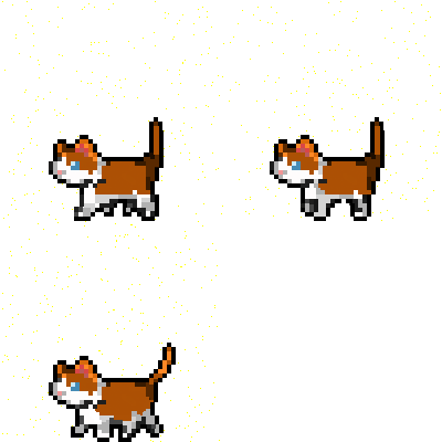
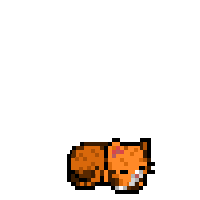
The Pixel art style makes its first appearance. Inspired by games like Deltarune, Balatro and Mina the Hollower I decided to apply the retro aesthetic to make the game more palatable towards the young adult audience. The decision was made to make the main cat sprites with the pixel art style.
A mix was used of Asperite for pixel art, photoshop for paintings and blender for the 3D animation for the character art.
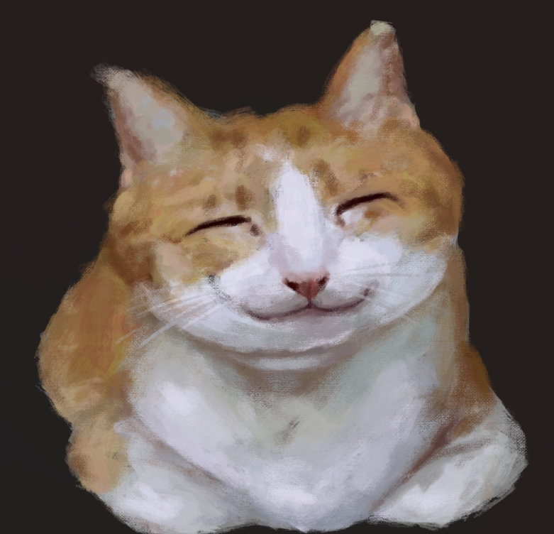
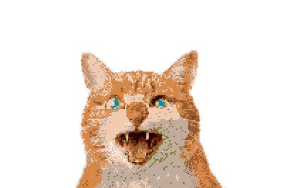
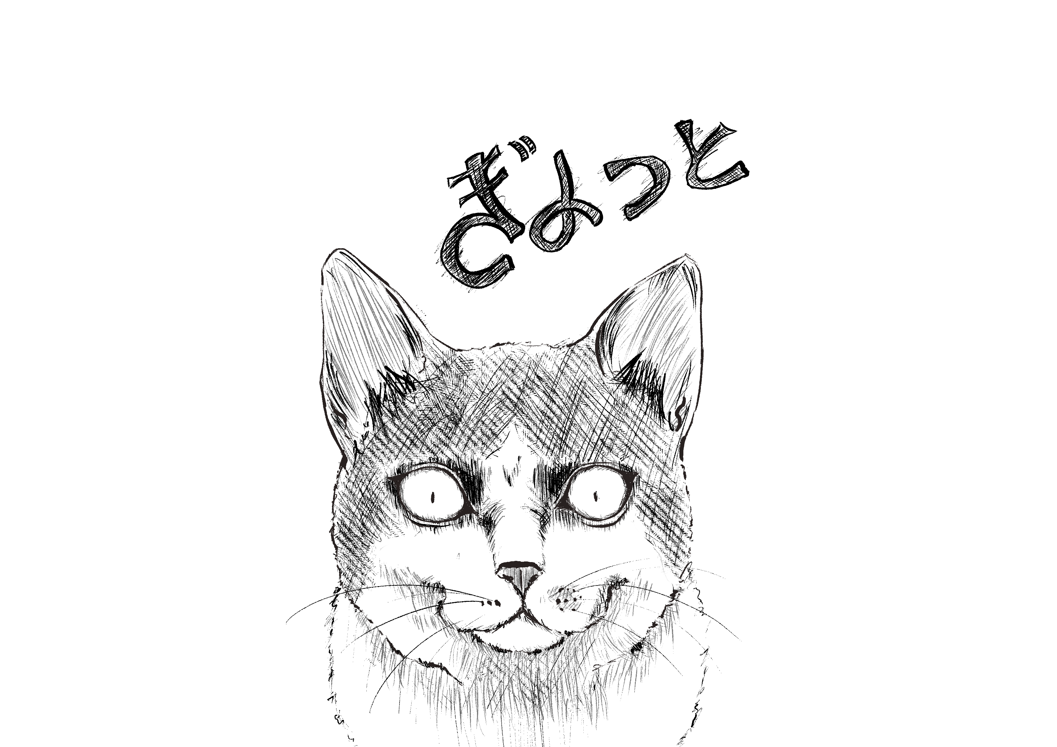
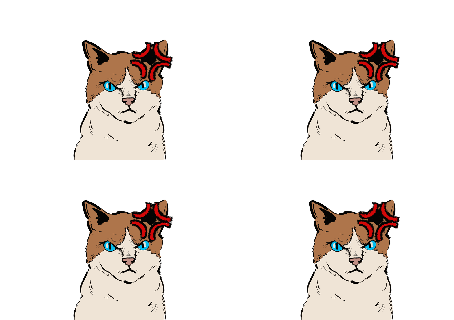
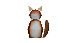
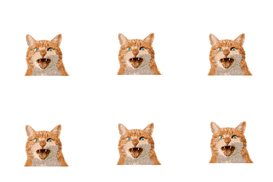
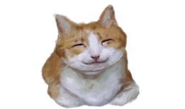
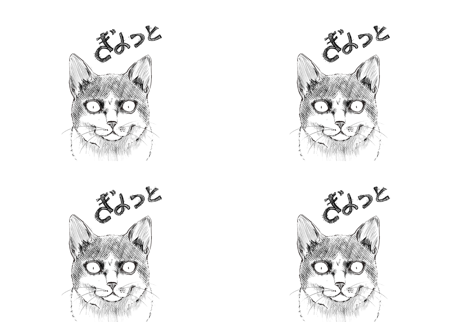
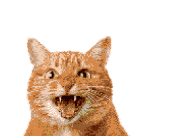
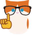
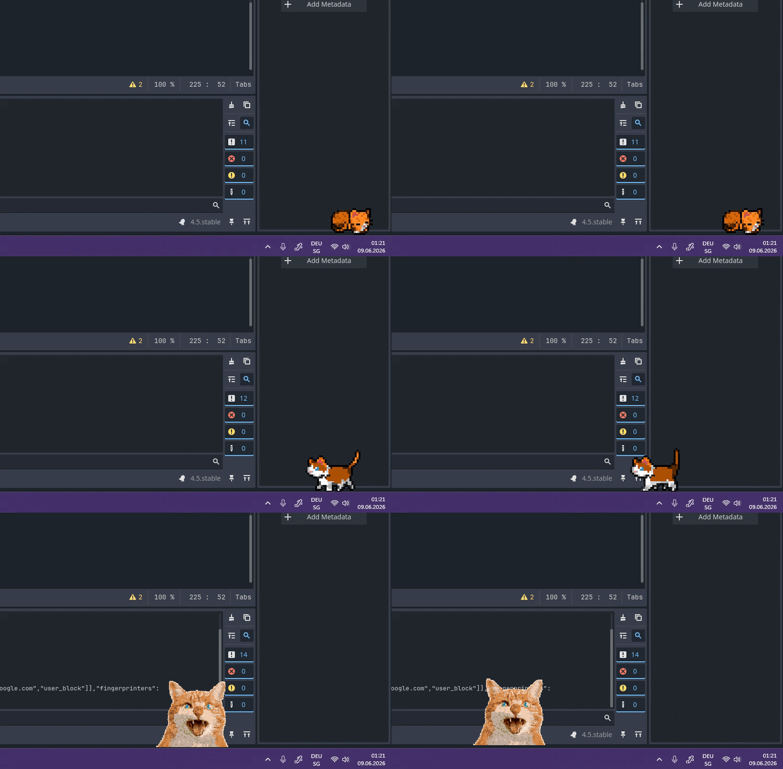
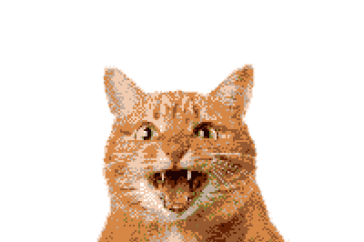
While pixel art works great to quickly create character sprites and animations, the simplicity doesn't lend well to expression. In reference to the usage of the cat as a meme, it was decided to use different styles for each emotion, to make the expression clearer and more playful.
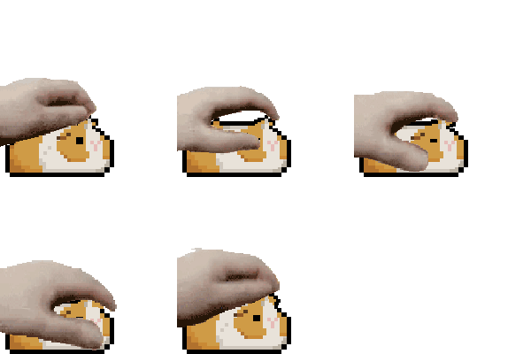
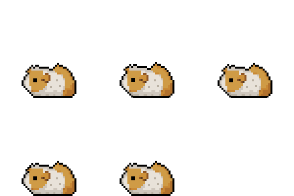
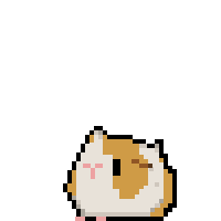
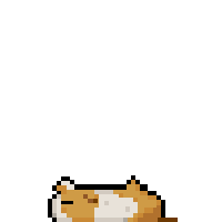
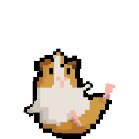
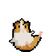
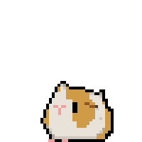
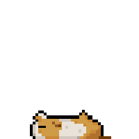
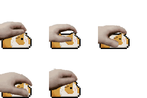
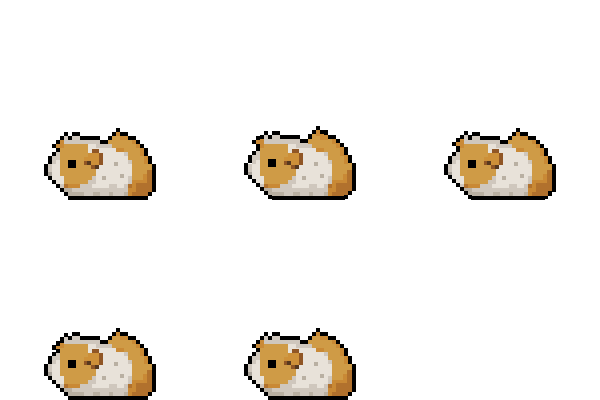
While theorising a potential pet customisation option, Raisin the guinea pig was conceptualised as a secondary pet that could be chosen instead of Chip. This idea was later discarded due to time constraints, with the idea of later implementation once the Bachelors project is finished.
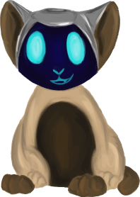
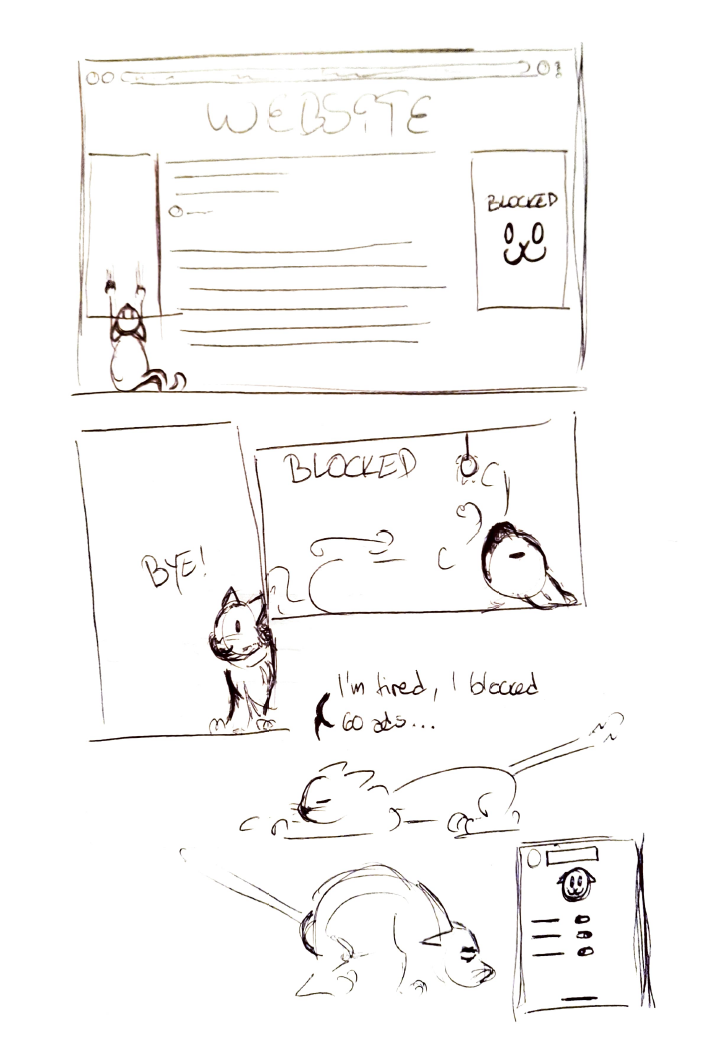
First ever drawing of Chip. The cat aspect is the same, alongside the idea of giving him a fur color related to cookies, though the aesthetic is clean and futuristic. Chip here is more of a cyber-cat entering your browser to inform you about cookies.
Desktop Pet, GUI
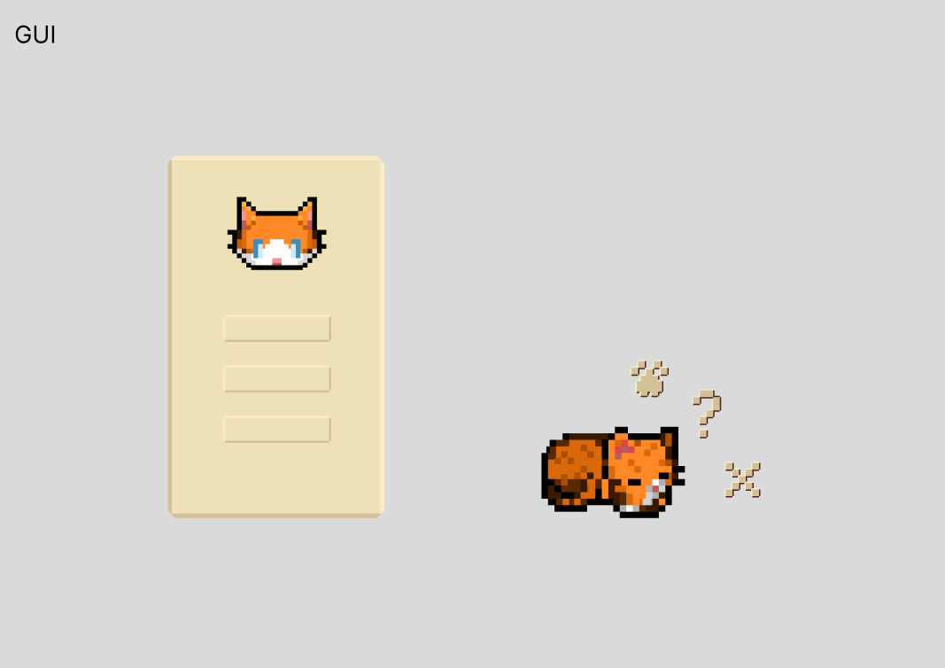
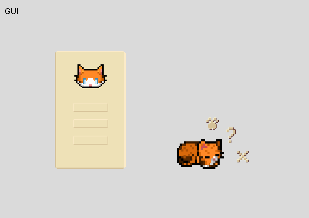
The GUI began rather simple, sticking with the pixel aesthetic and attempting to incorporate colors coherent with the cat design. Initial designs were the icon, the radial menu and a basic settings menu. The only remaining design from this step is the icon, as the settings menu was redesigned and the radial menu was later removed.
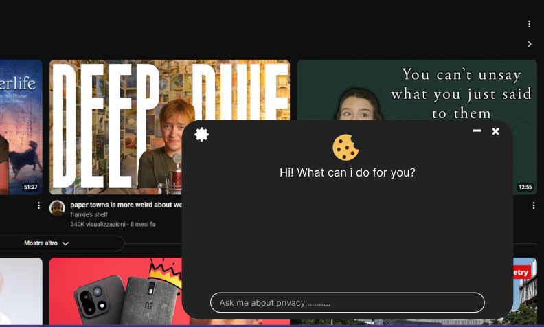
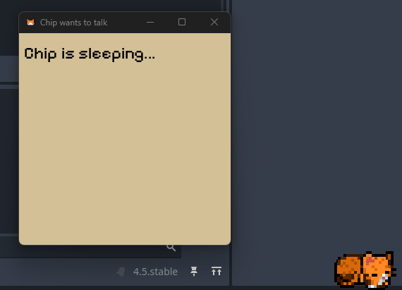
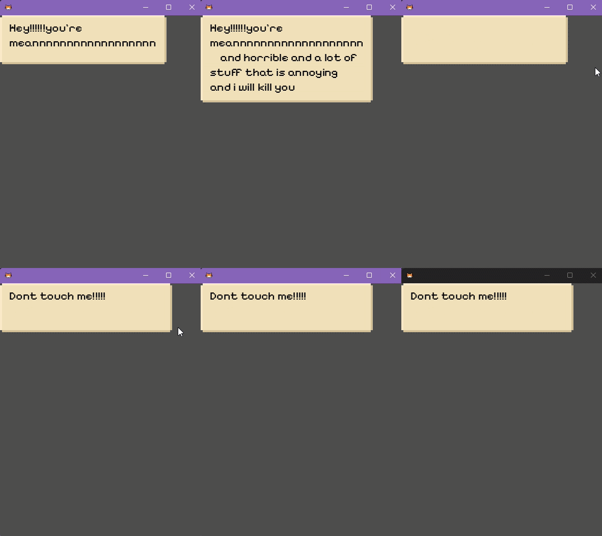
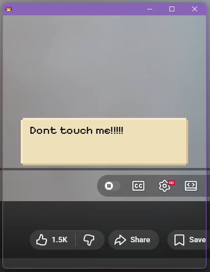
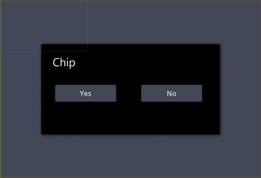
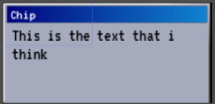
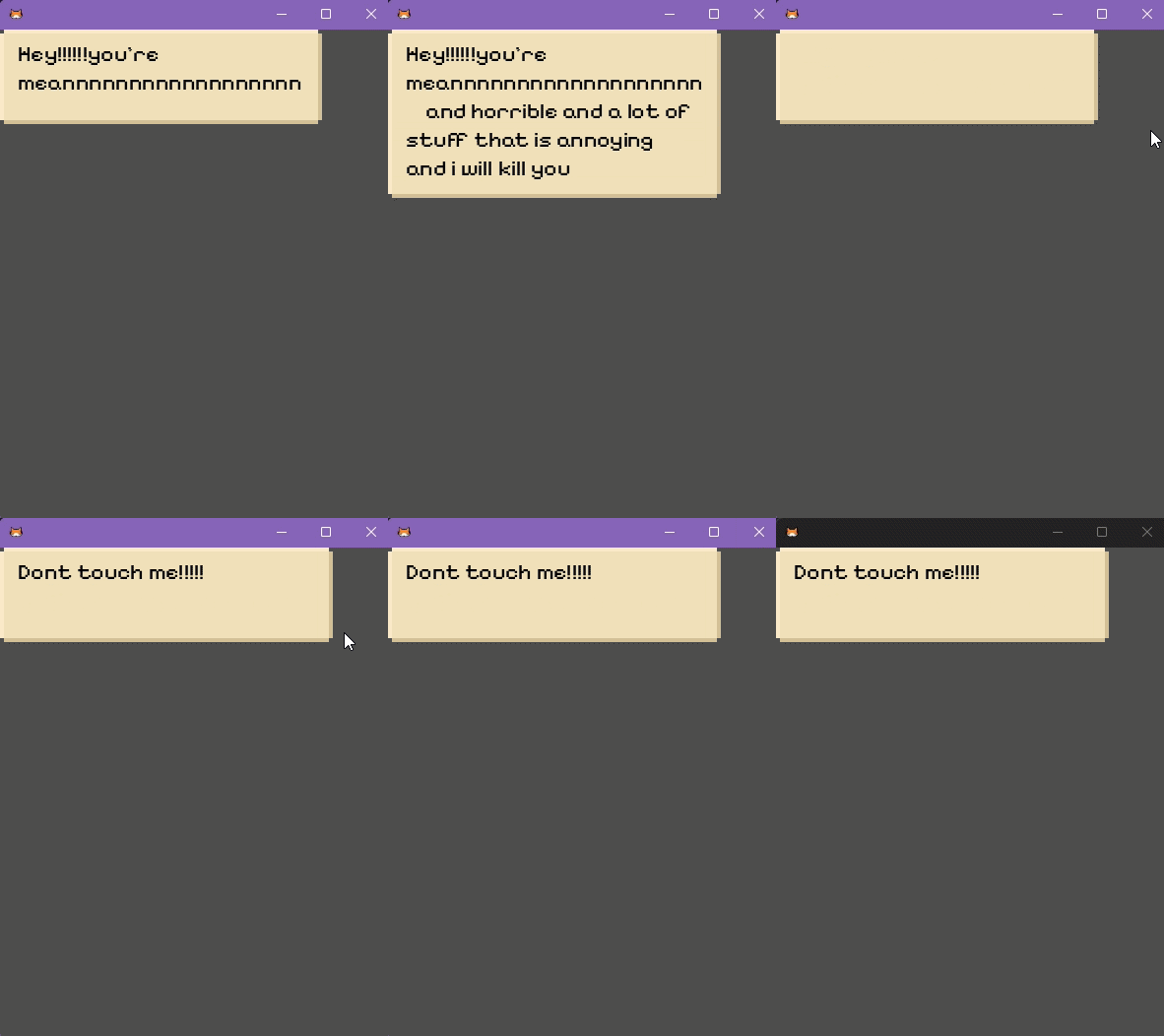
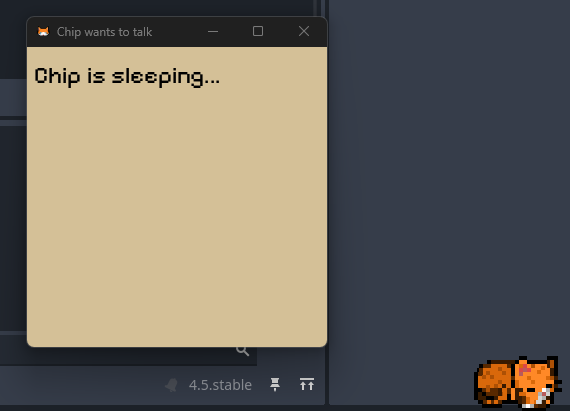
At this step a basic text box was introduced, utilising the native windows app pop-up. This was merely due to me not knowing that could be disabled, so at this stage the text box is just a basic app window with the same color used previously for the radial menu and settings attempt.
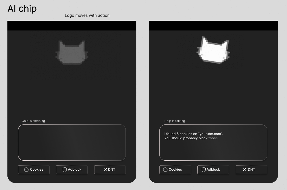
Later attempts were made to refine the app window concept, to actually design its contents and add to the overall aesthetic of the app. Two main ideas were tried, the first being an AI inspired idea with sleek and modern design choices with the added white icon that acts according to the situation. While this idea was liked by mentors, my opinion was that it clashed too strongly with the design of the cat itself.
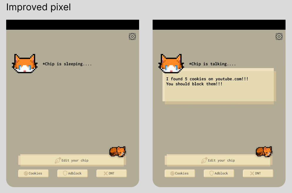
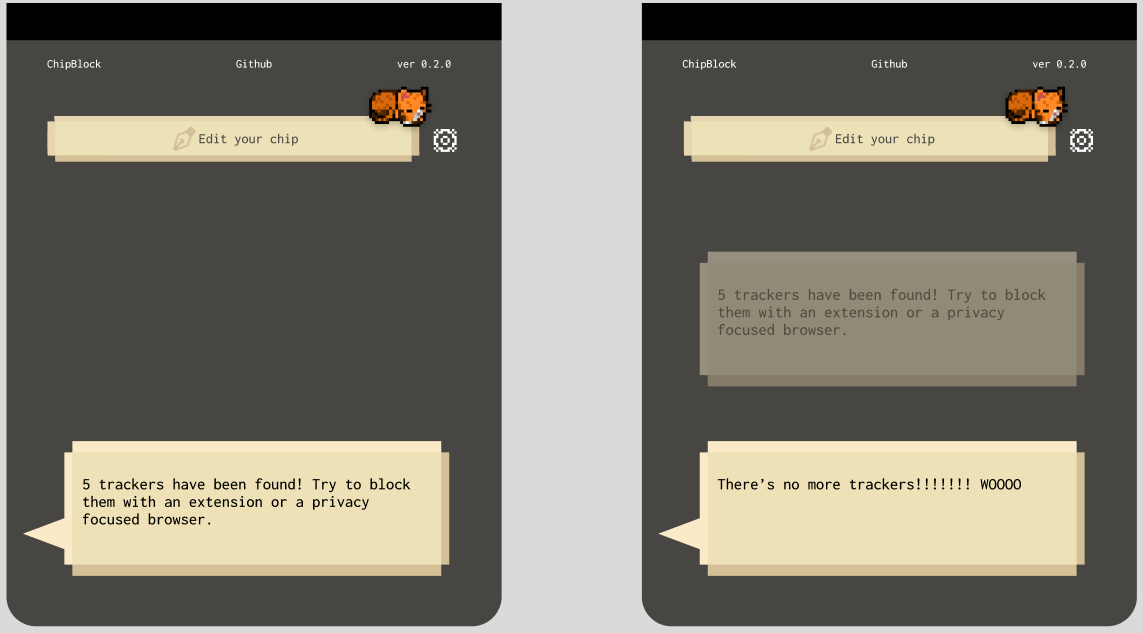
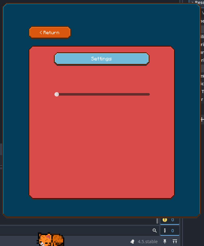
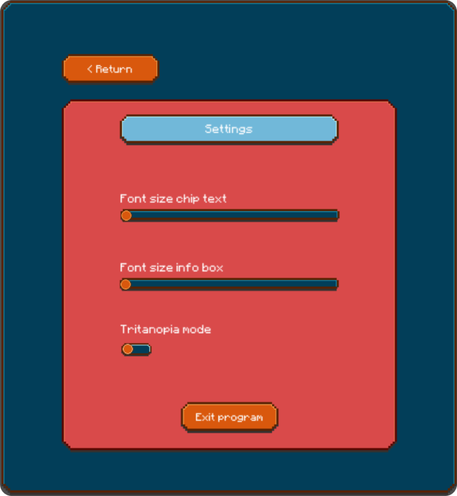
The second idea was trying to stick to the pixel/video game aesthetic, with adjustments to make it seem much more like an actual game window chip is using to communicate, alongside settings options.
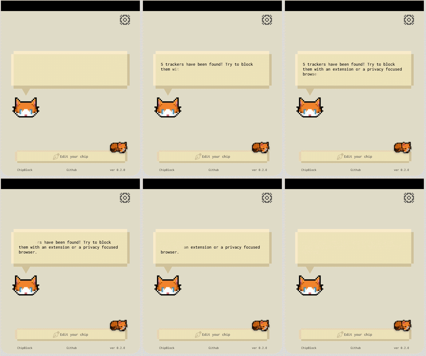
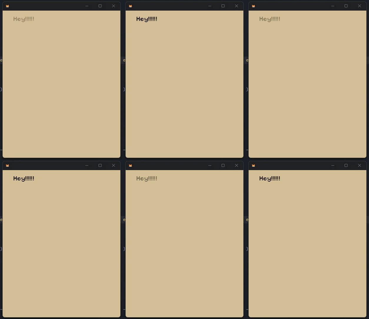
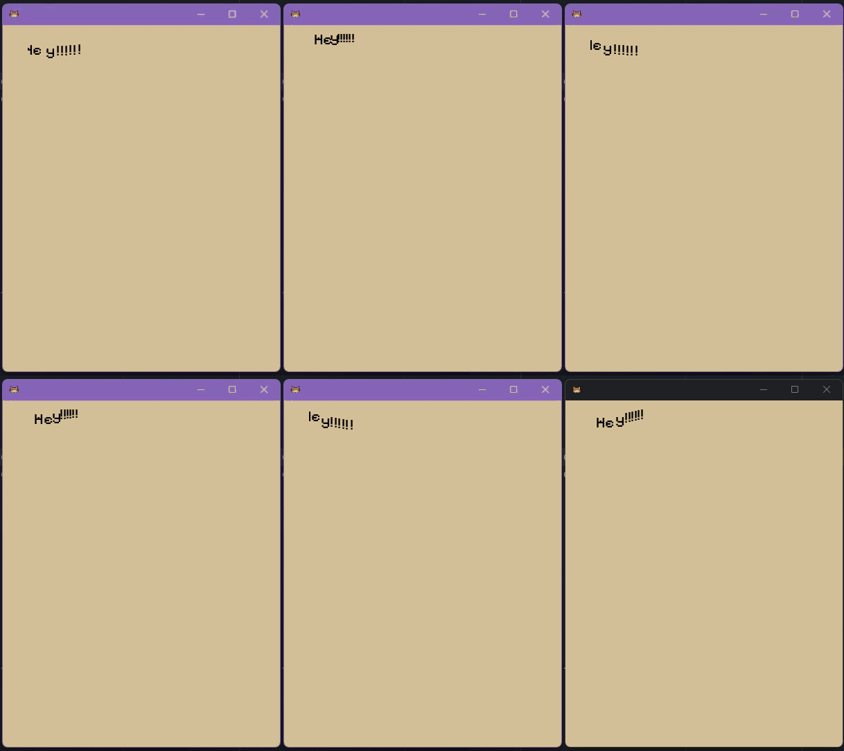
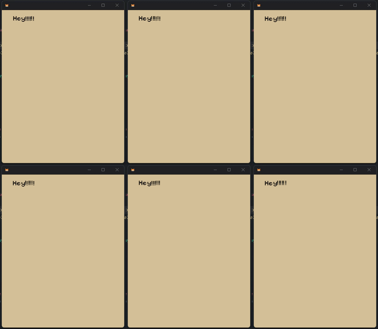
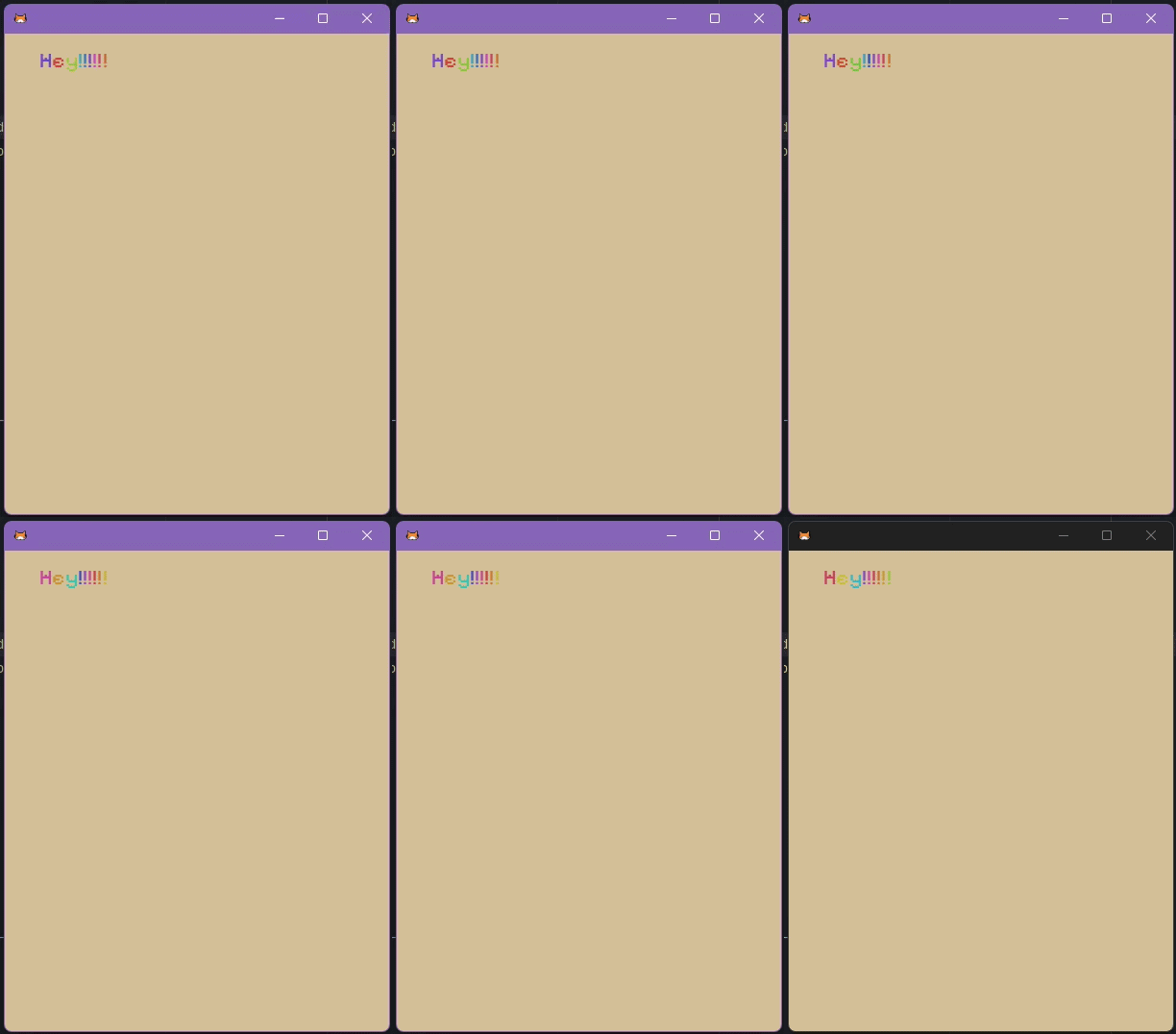
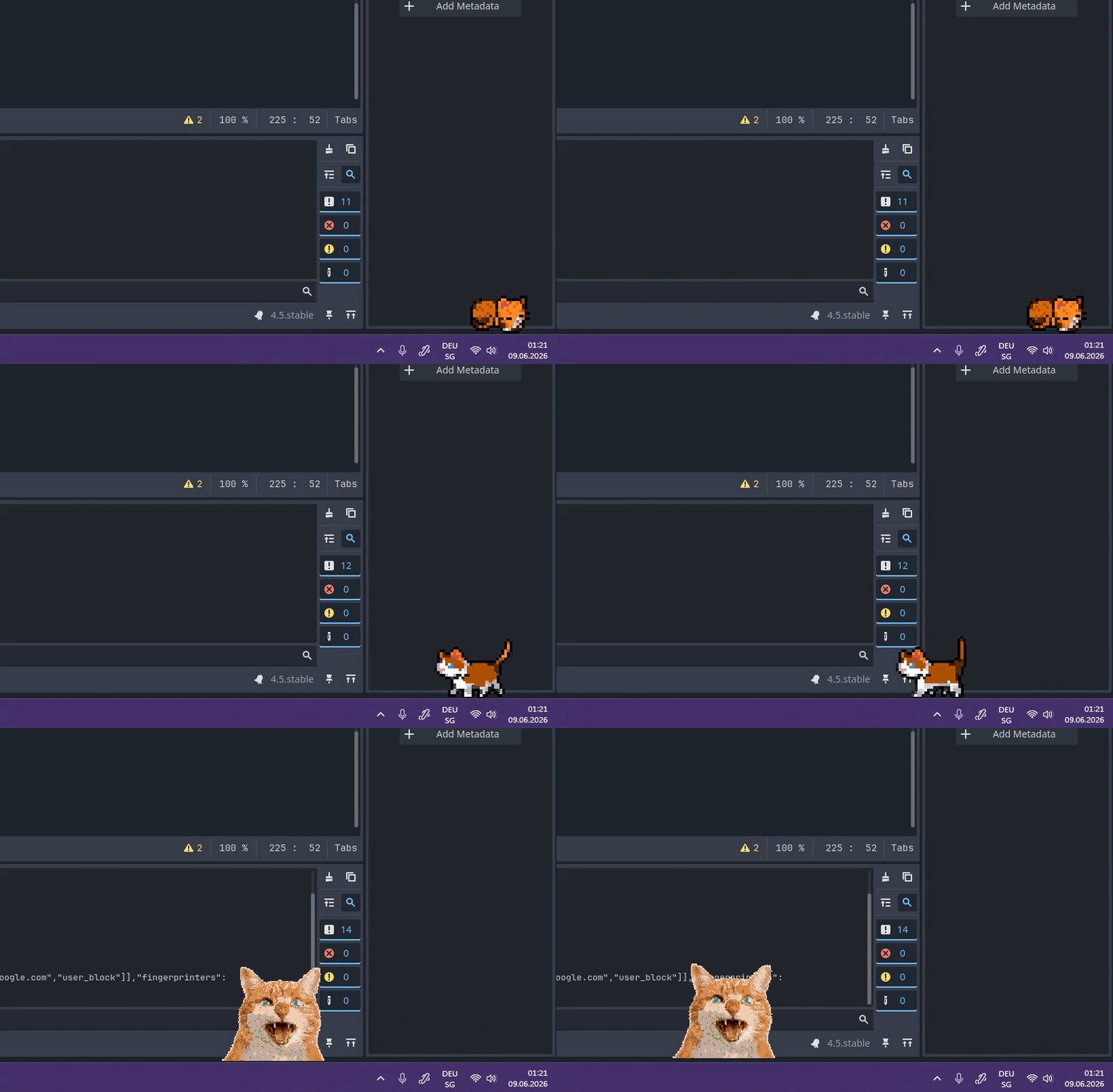
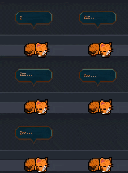
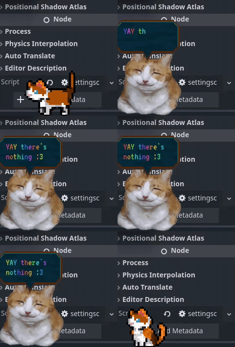
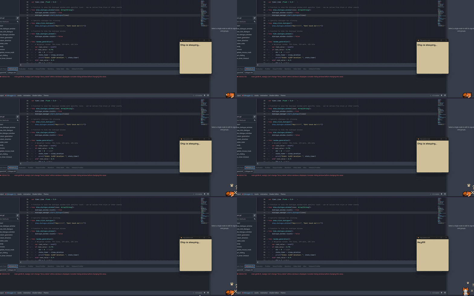
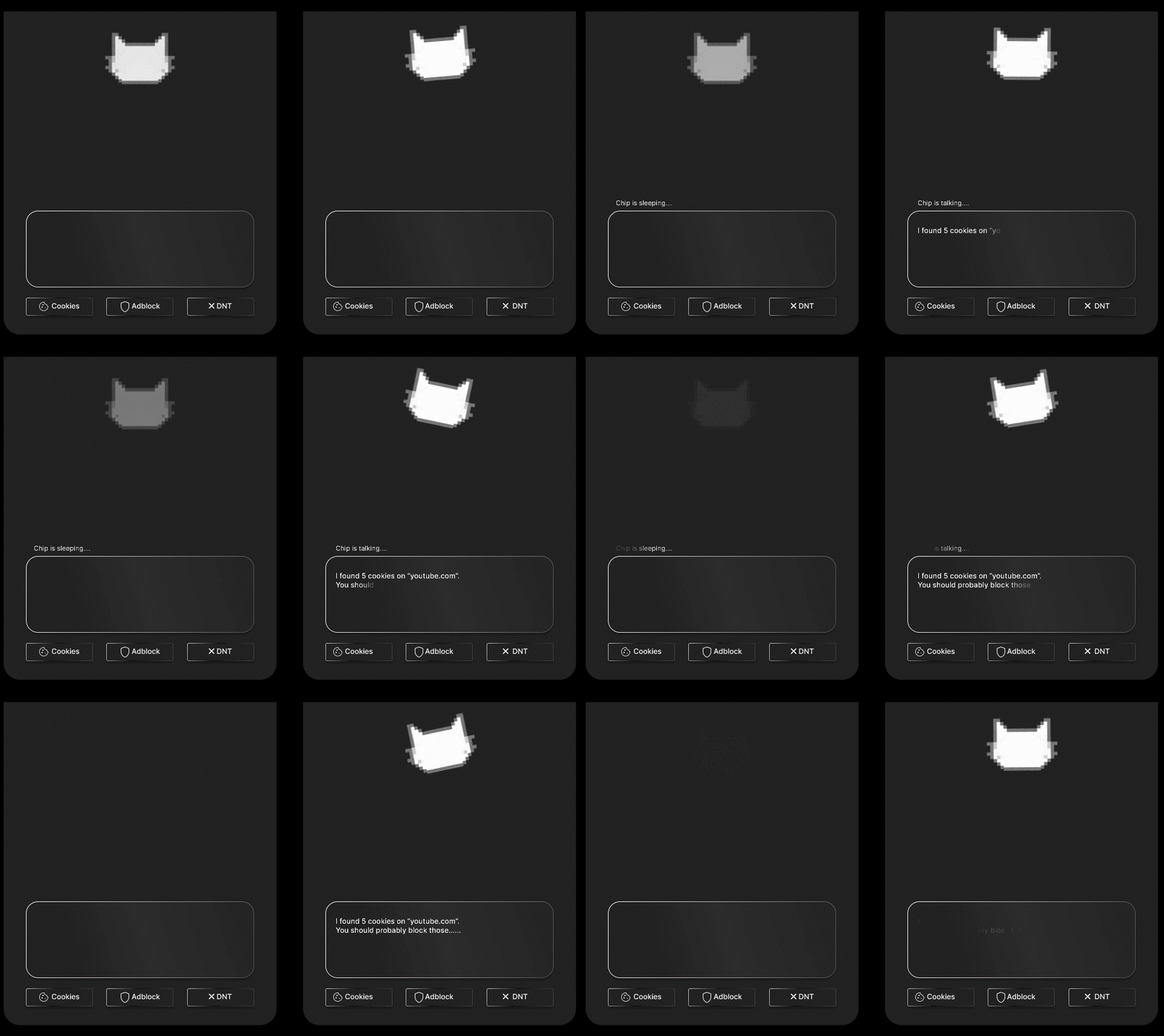
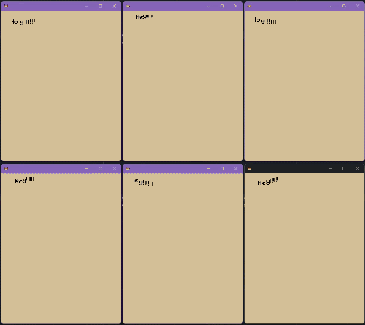
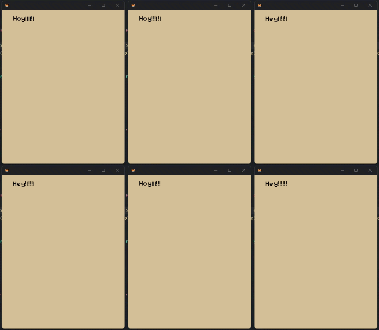
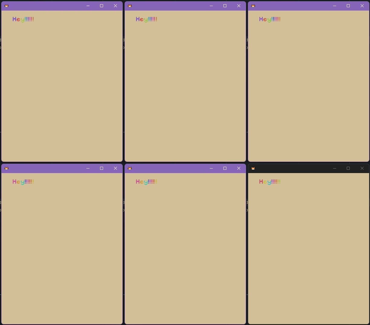
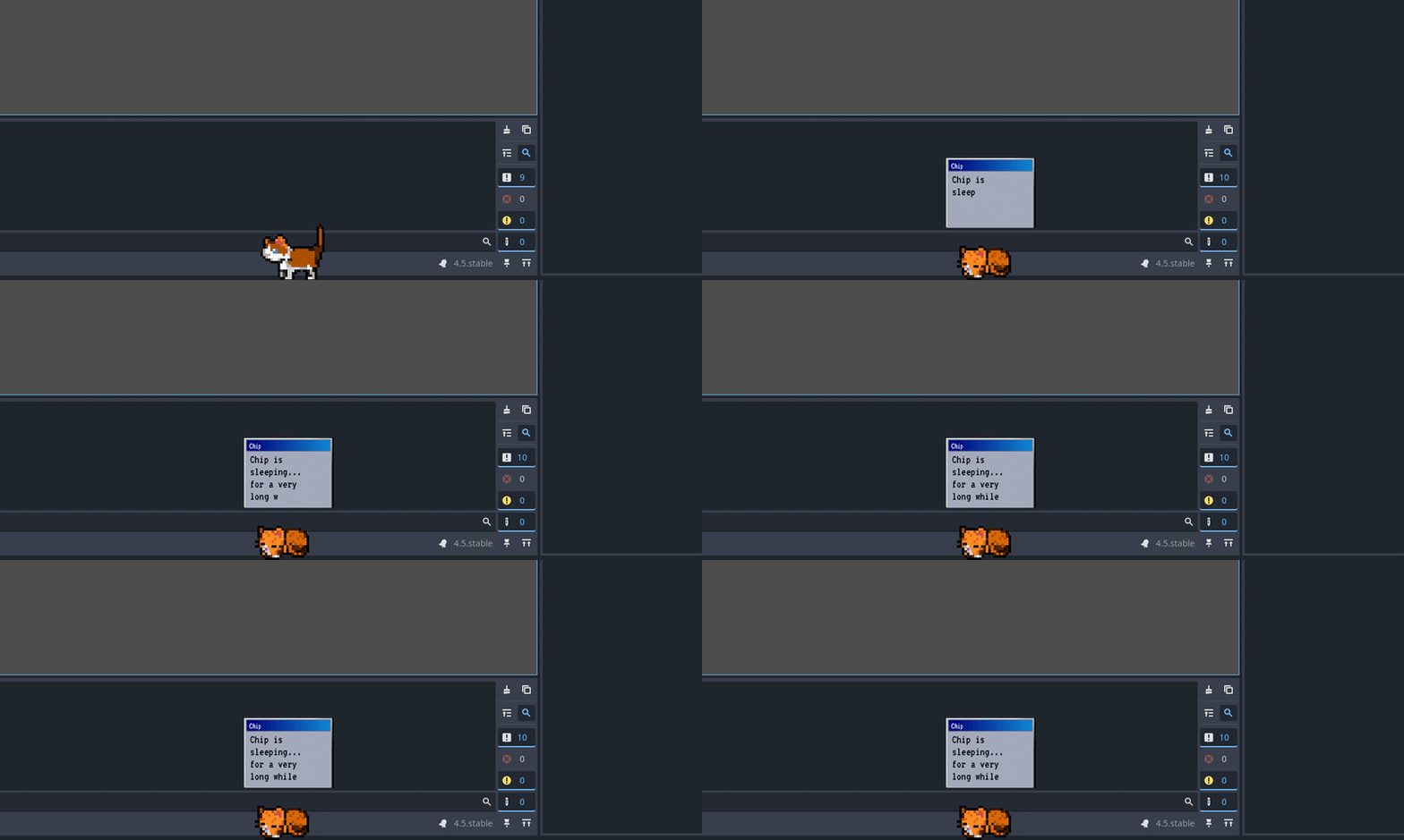
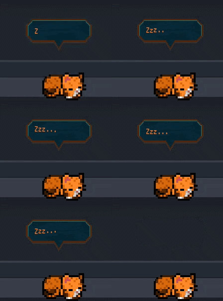
While researching the game engine I am utilising for this project, Godot, I was made aware that animating text is rather easy. This step was merely cataloguing the different possibilities of animation that could be used later to further enhance the visuals of the GUI.
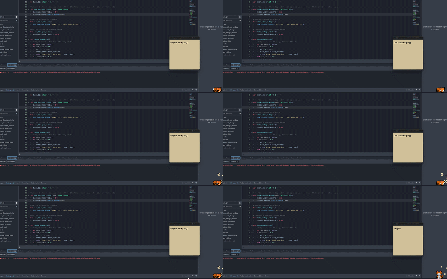
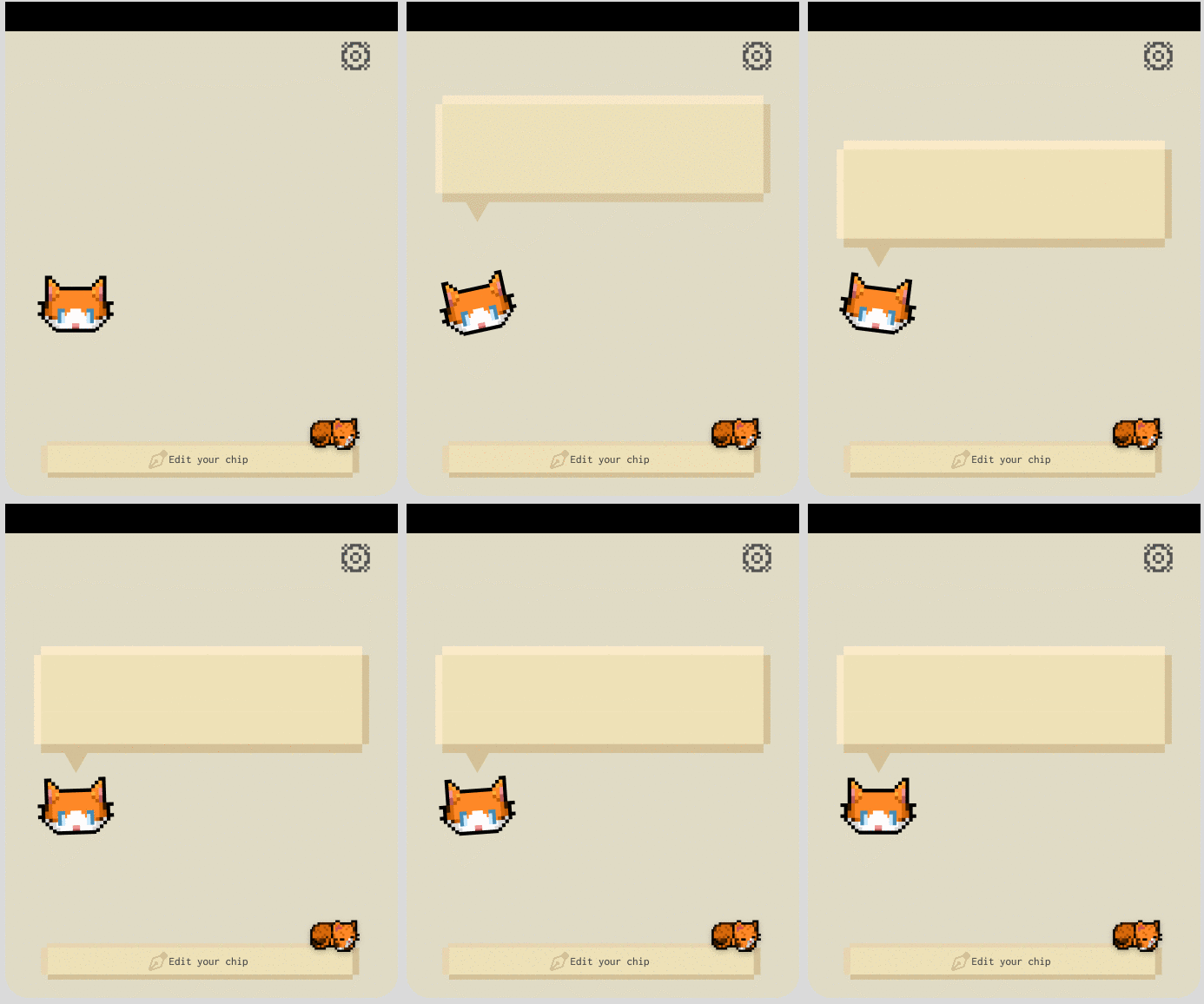
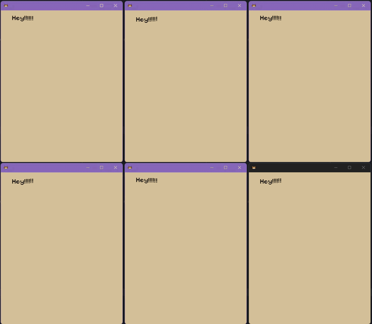
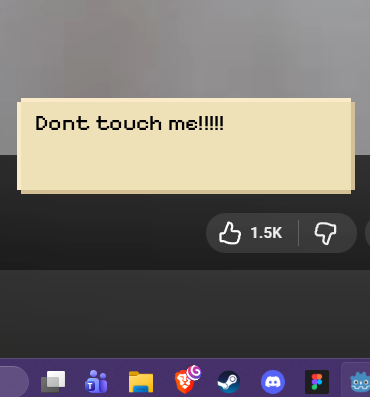
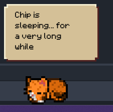
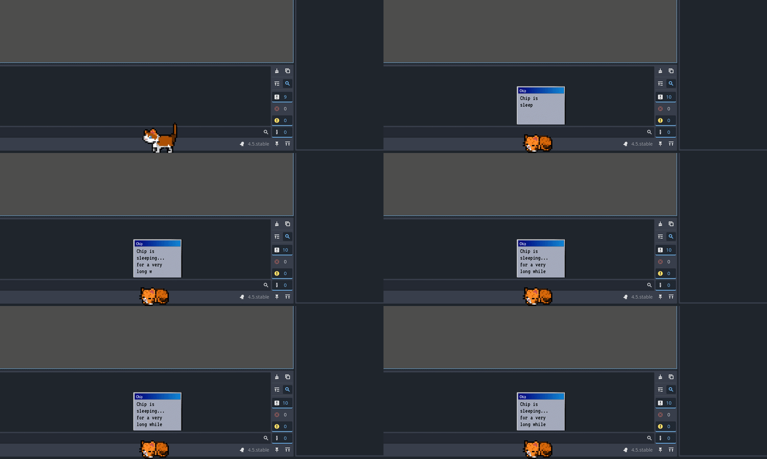
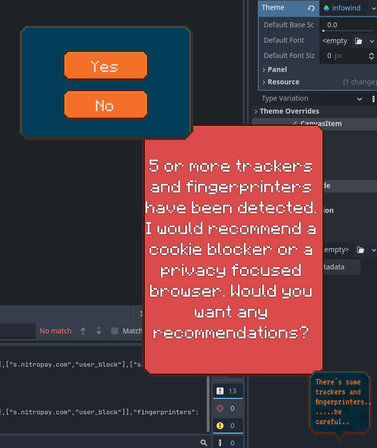
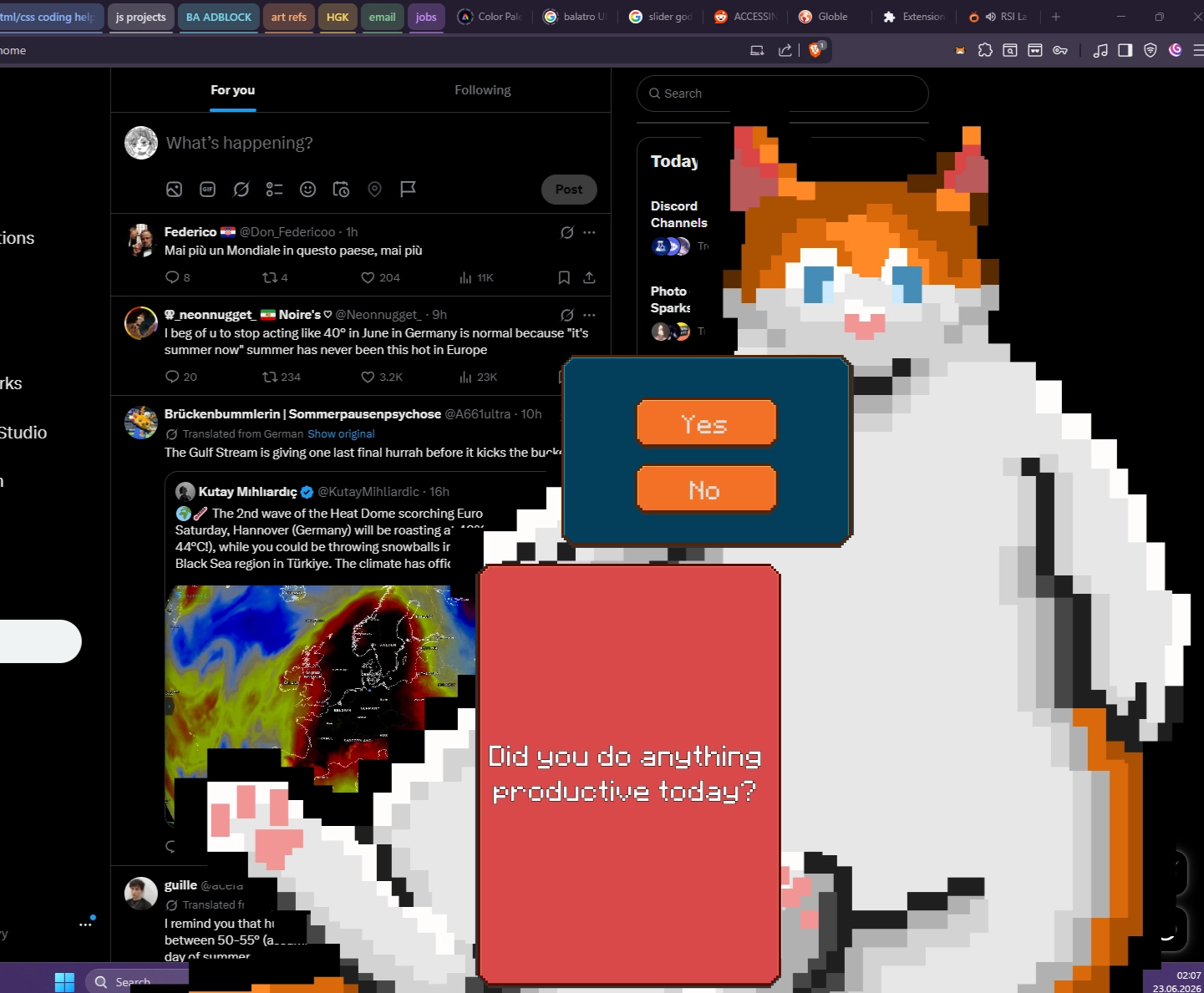
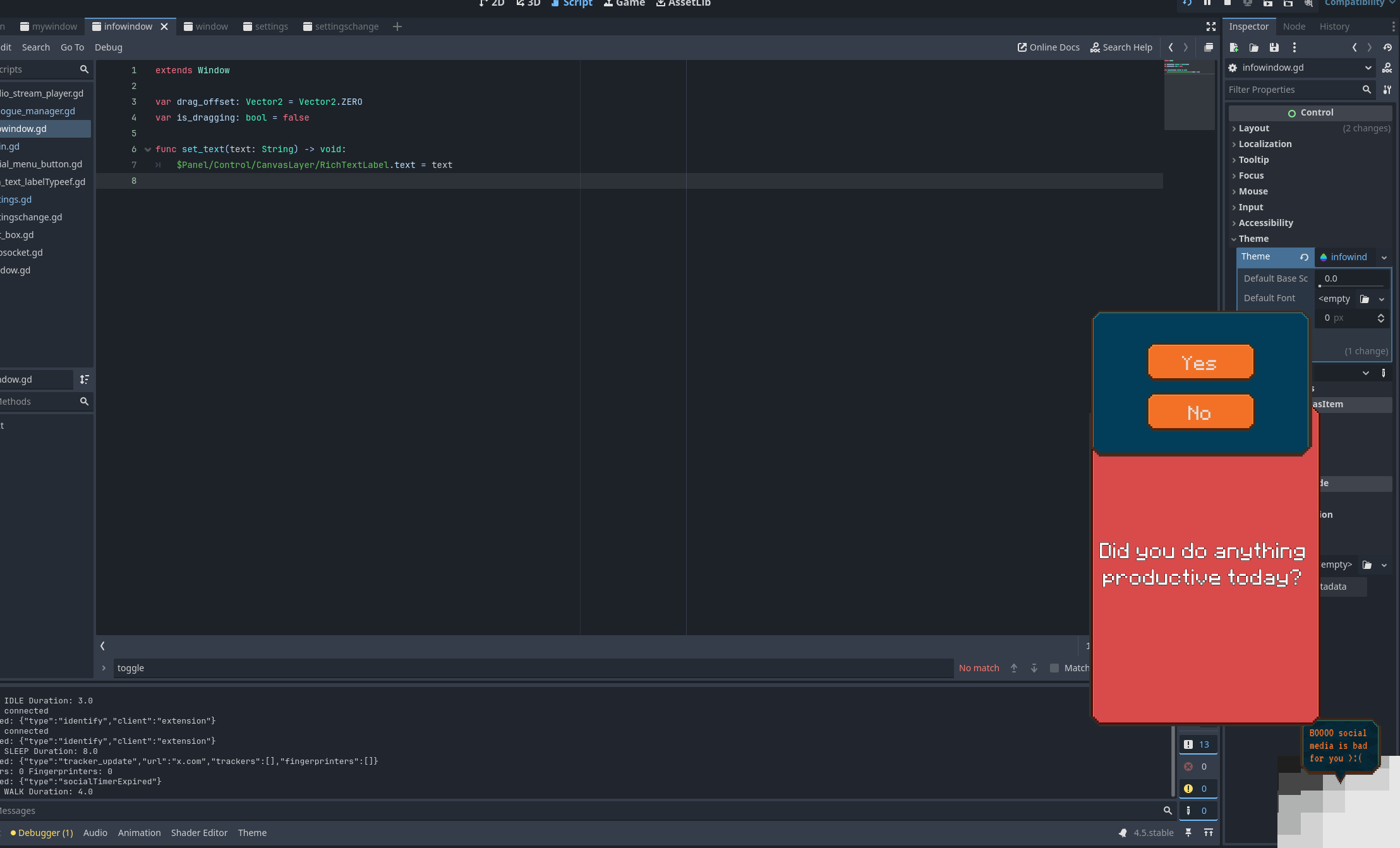
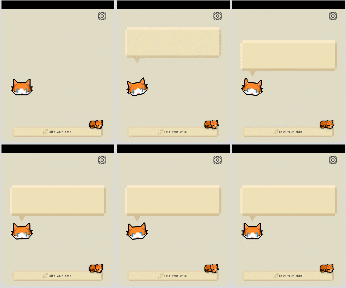
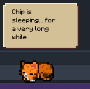
In a later occurence while coding, I stumbled upon the ability to make the app window transparent, thus only showing the contents. This lead to the first animated text box, growing in size with the size of the text.
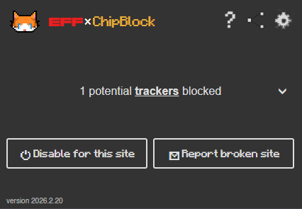
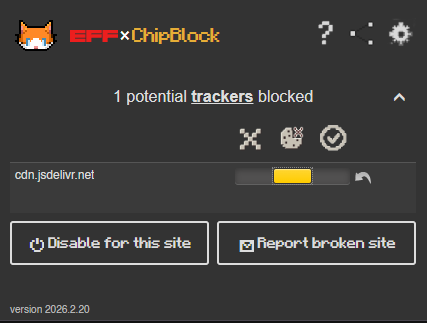
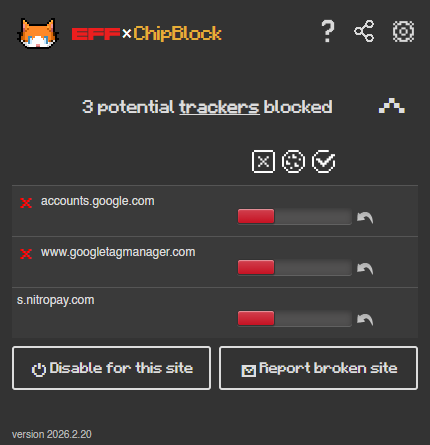
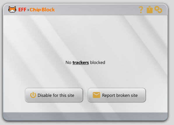
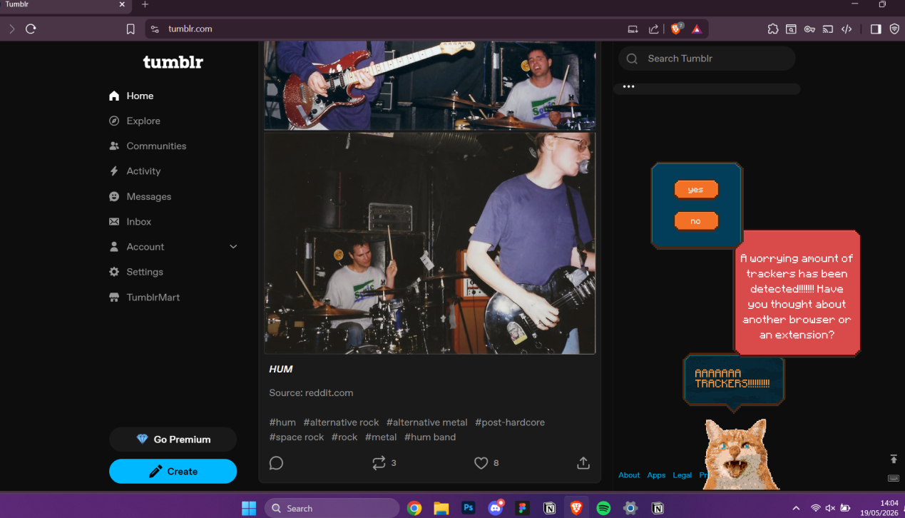
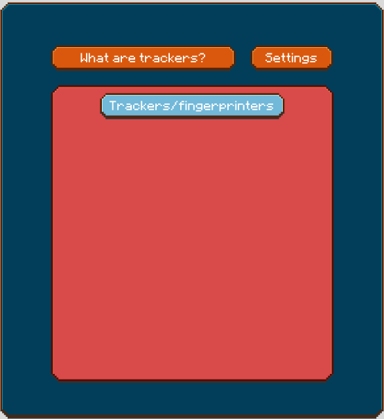
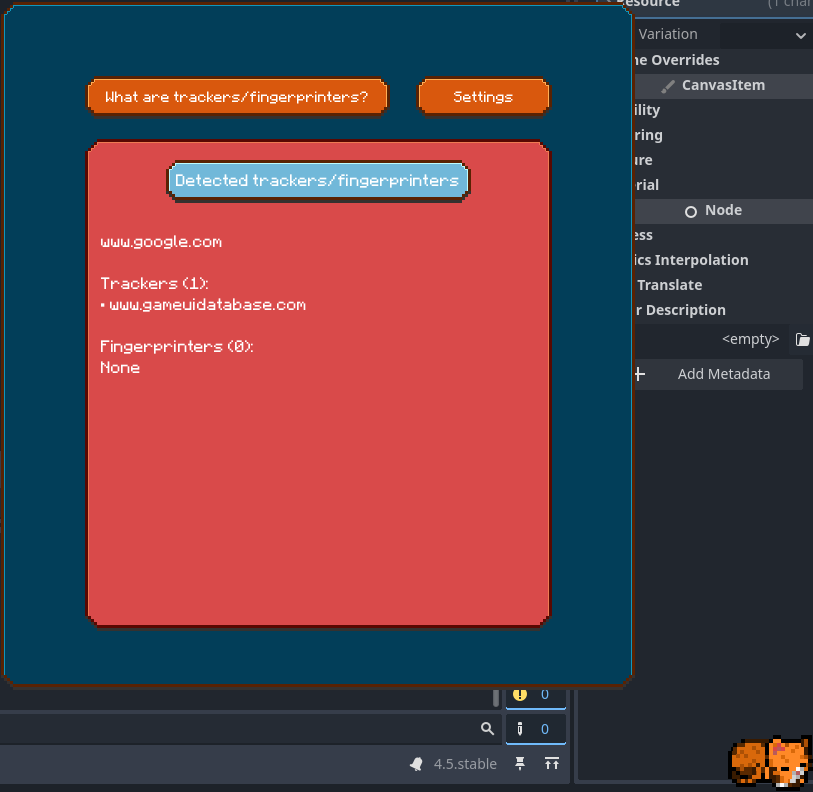
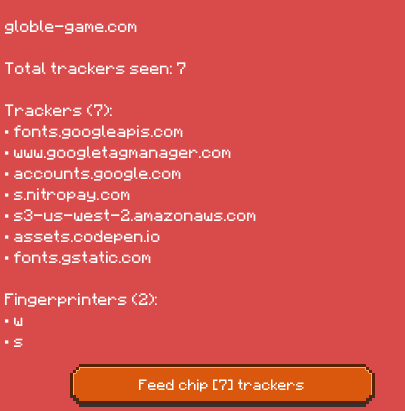
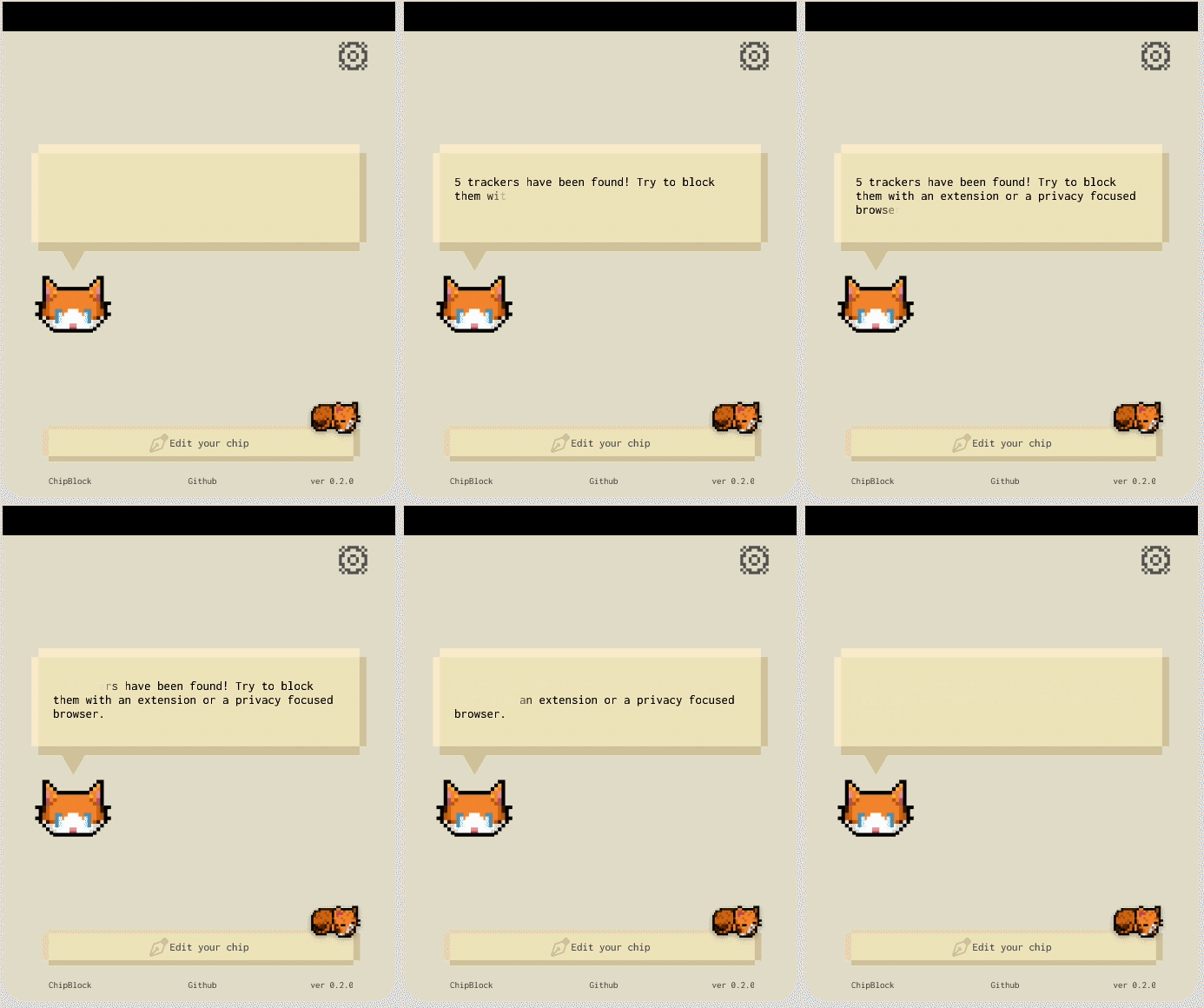
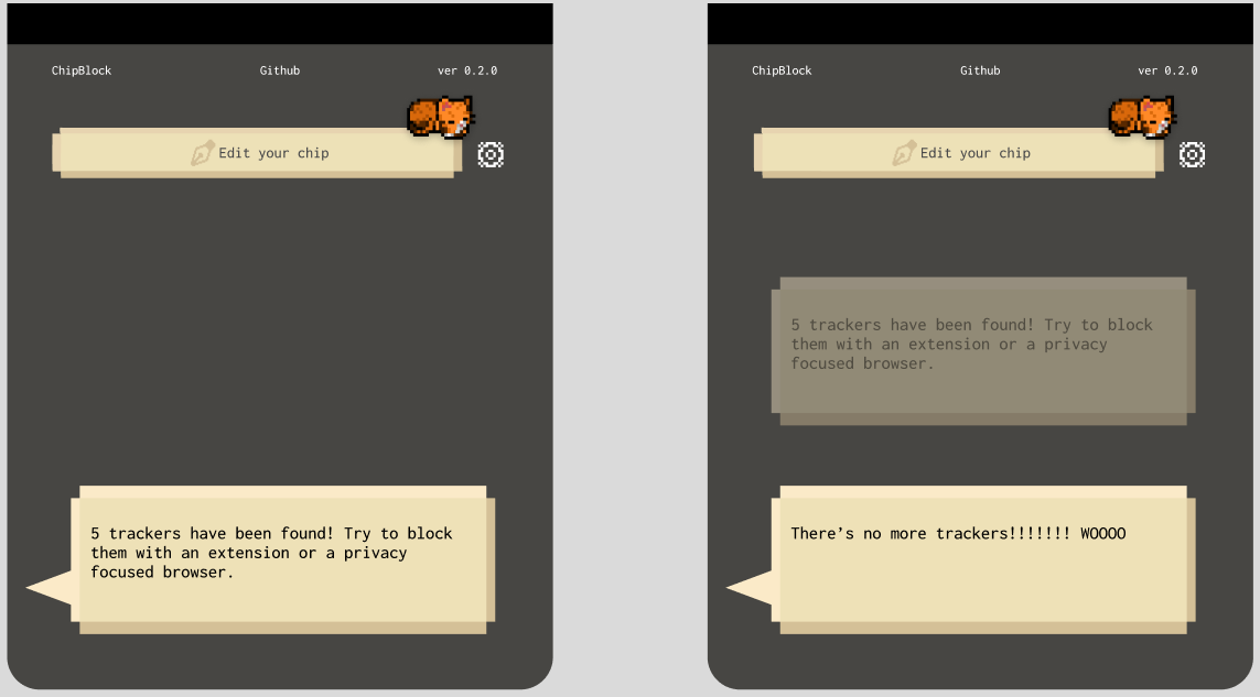
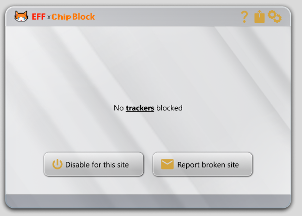
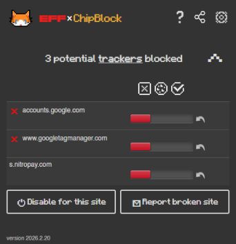
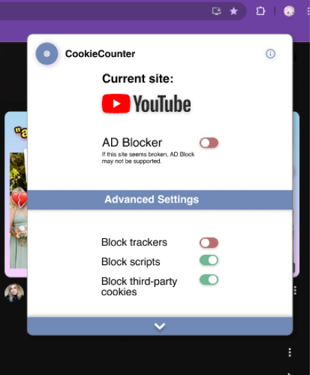
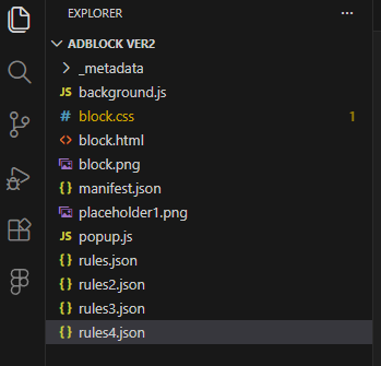
By side, the plug-in utilised to feed tracker data to the app was modified from the original look of privacy badger. The additions serving to add the pixel aesthetic to remain consistent with the app. Due to the fact this is intended to be removed in later versions and time constraints this was the only extent of the designing.
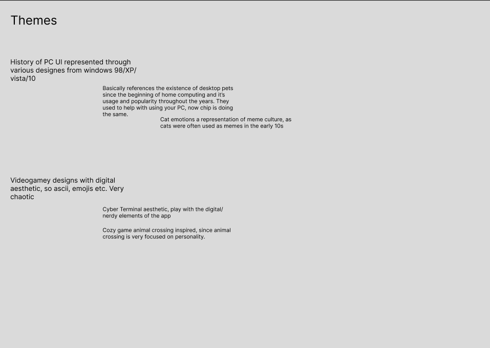
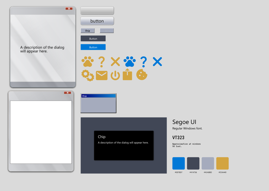
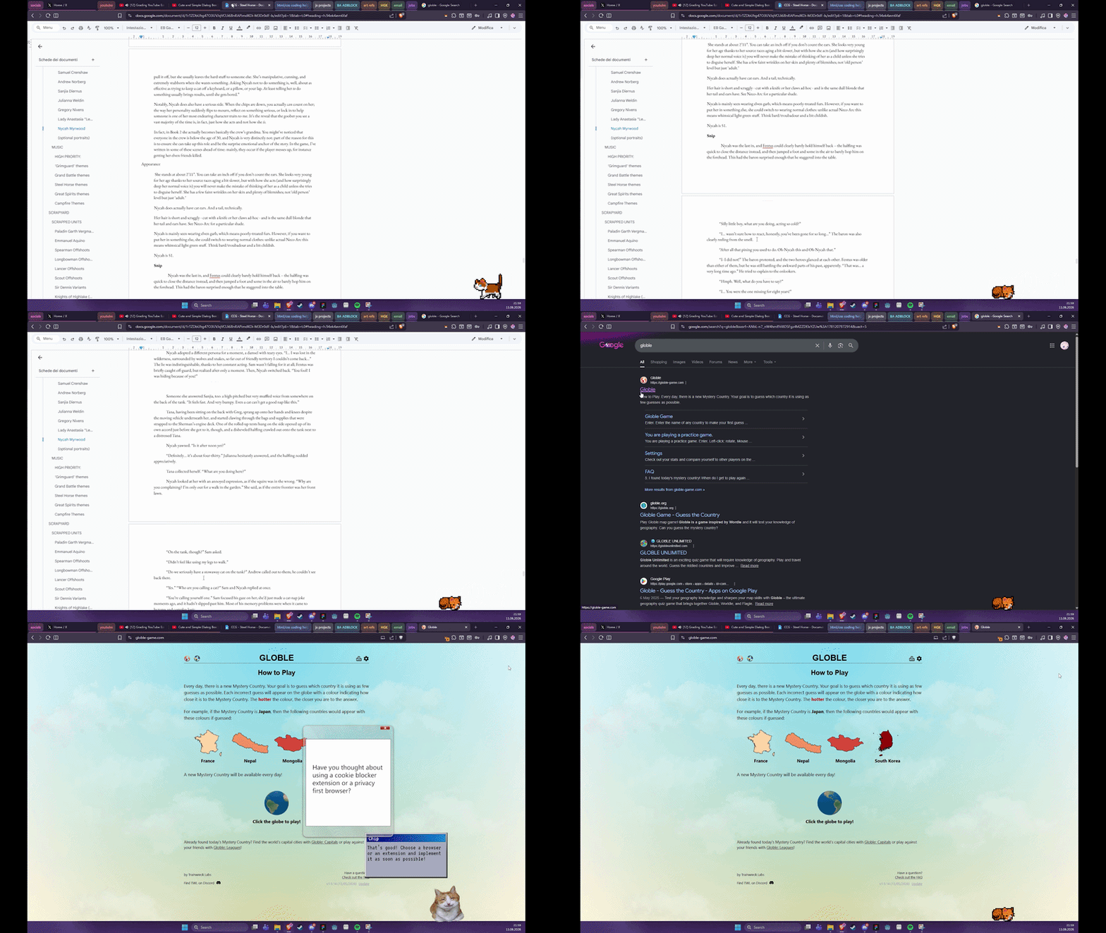
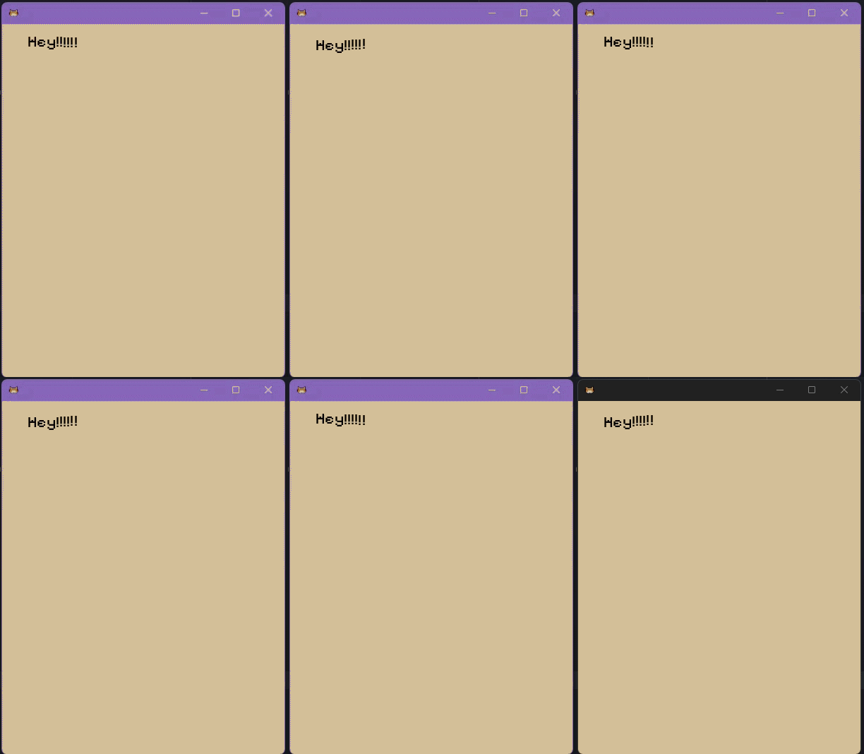
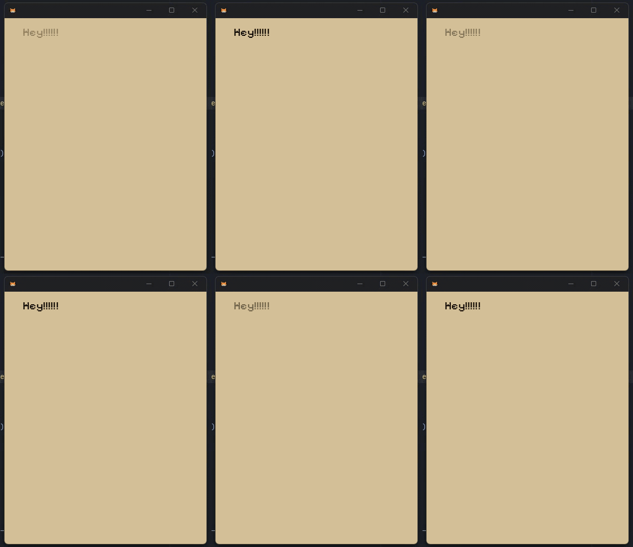
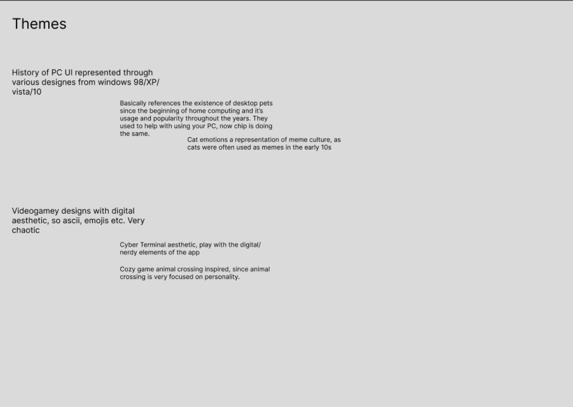
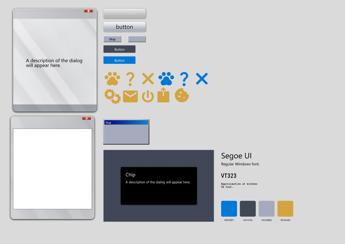
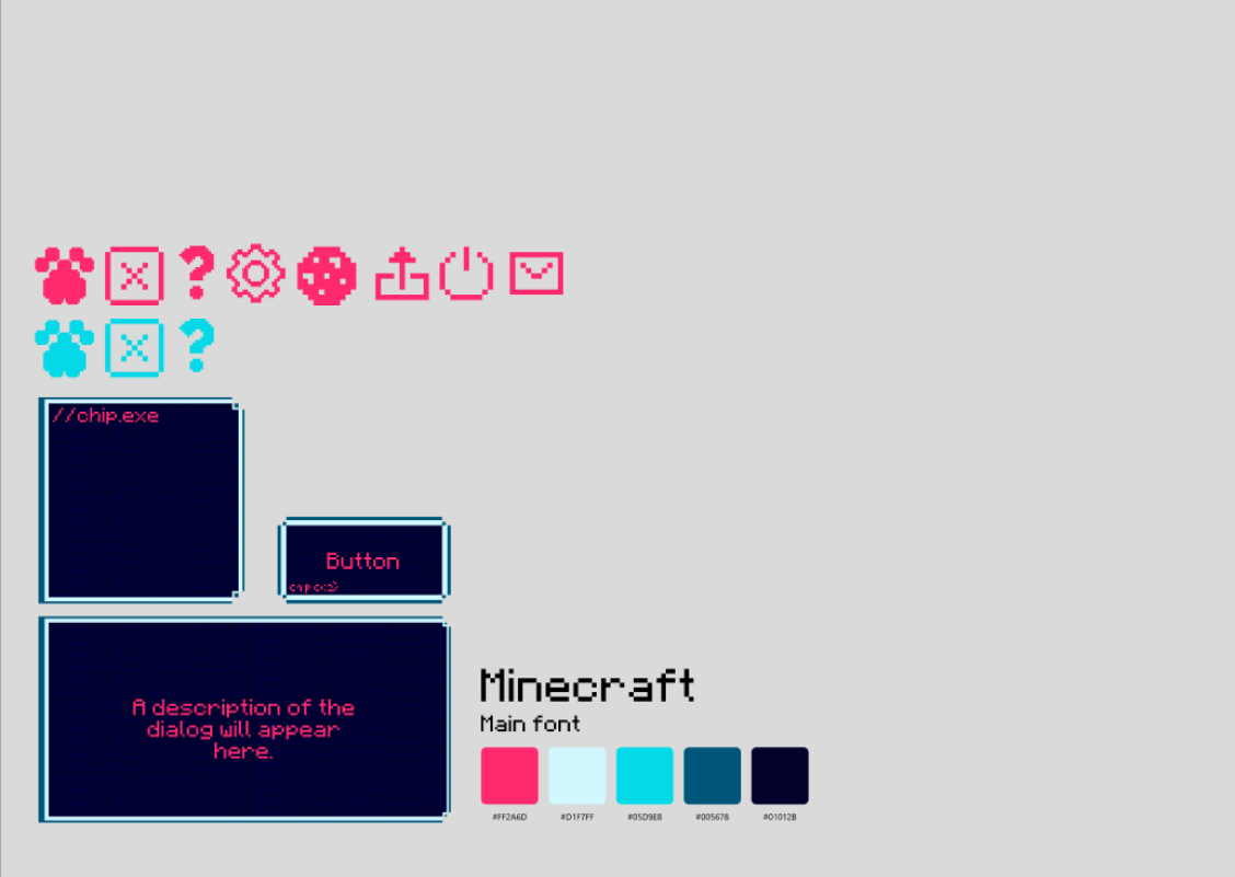
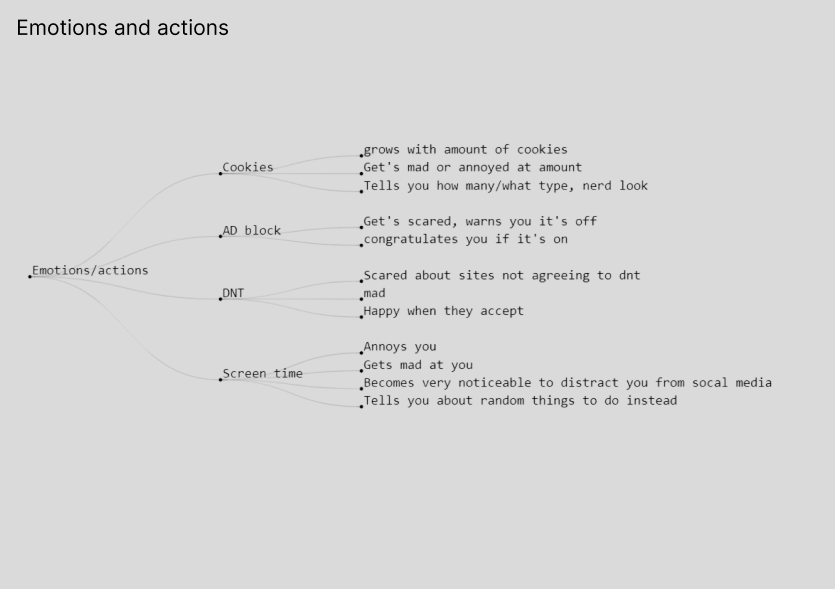
After middling success with the last few designs, I went back to brainstorming, reaching two possible ideas for the GUI as described below. The windows history idea in my mind seemed the most promising, so further care was taken to create a plug-in design and later on implement it within the app.
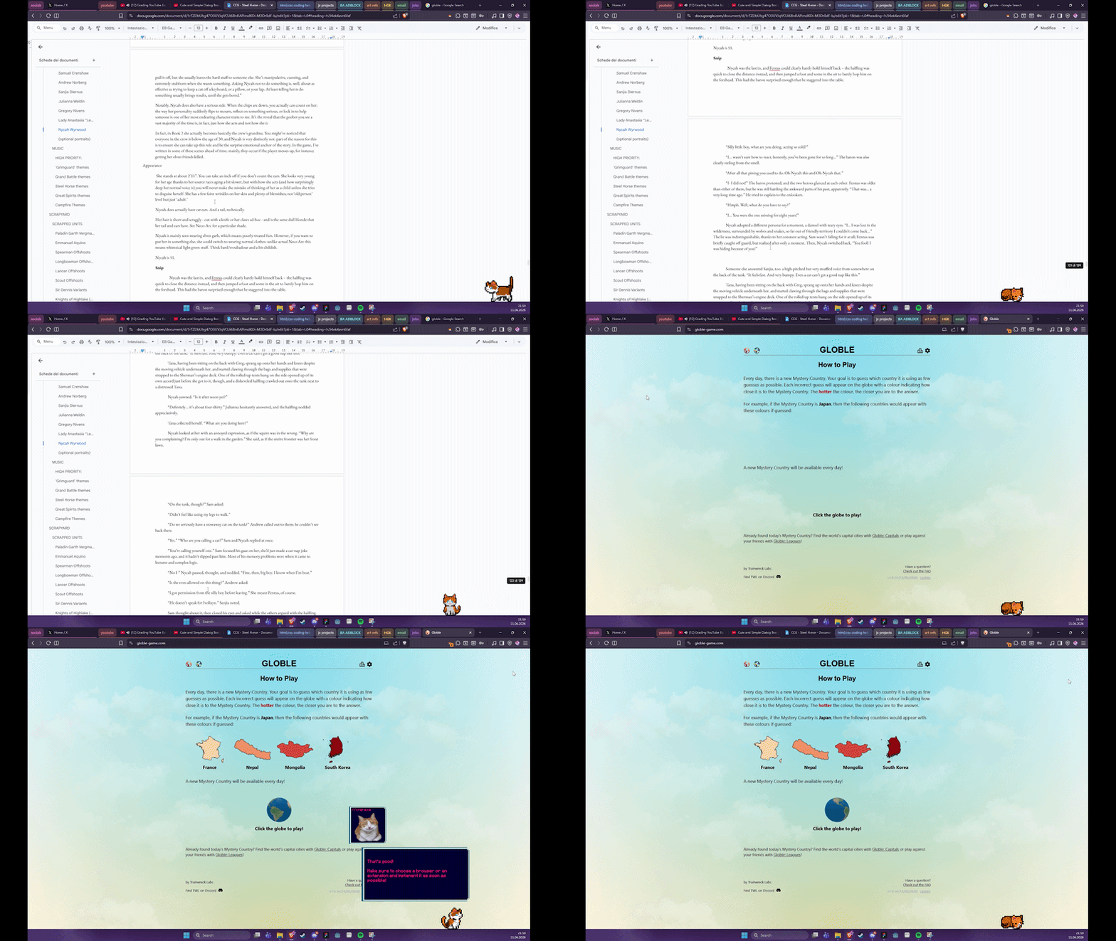
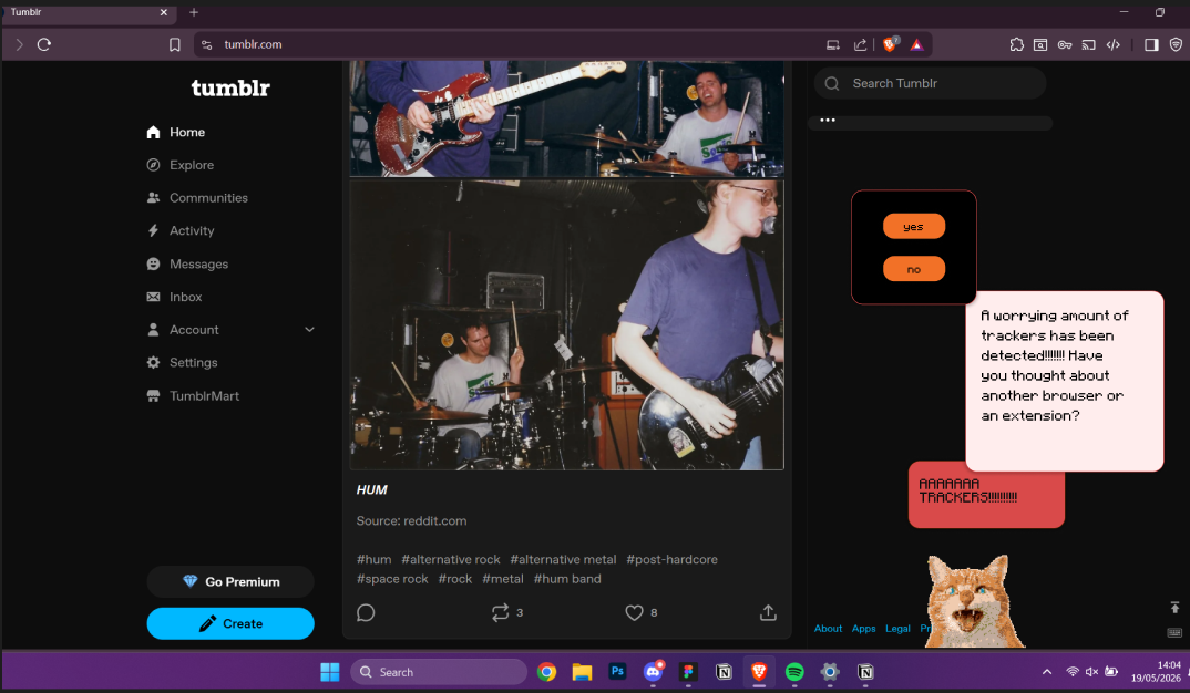
Demos created to give an idea of what the different styles would look like in context during a tracker warning.
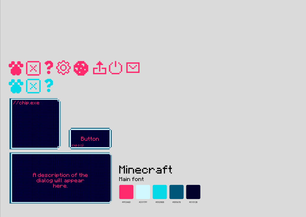
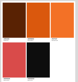
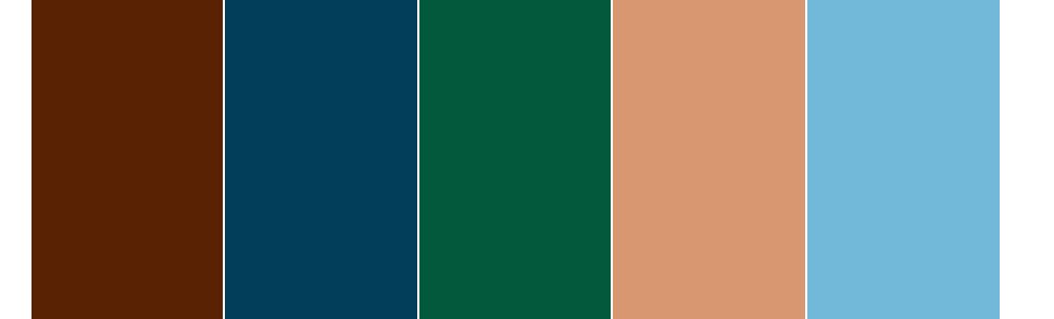
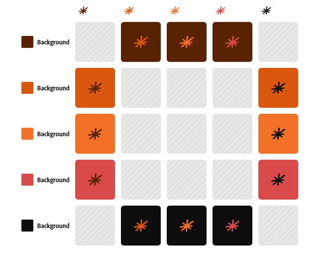
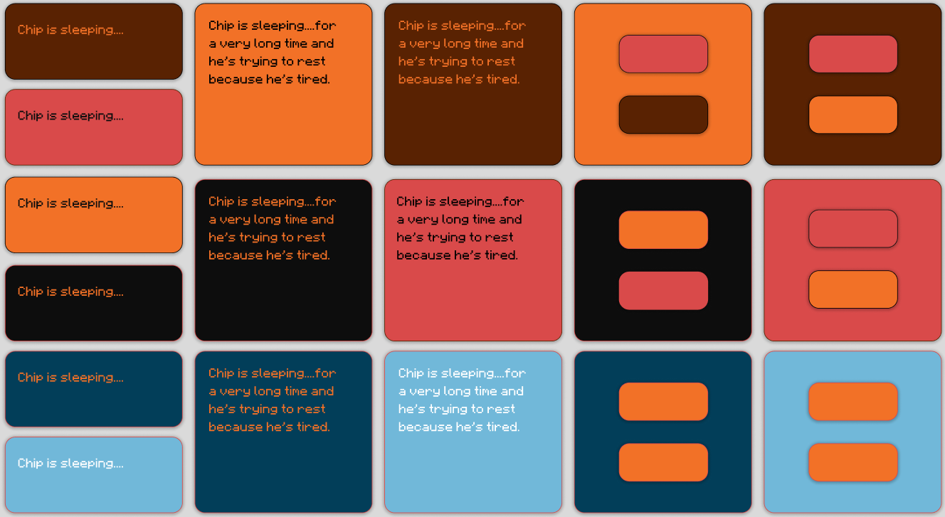
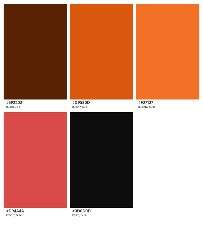
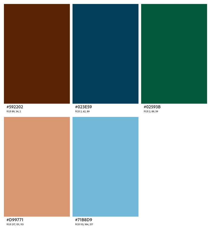
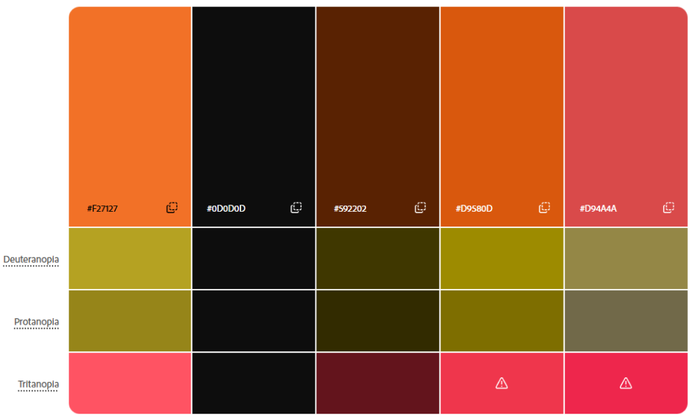
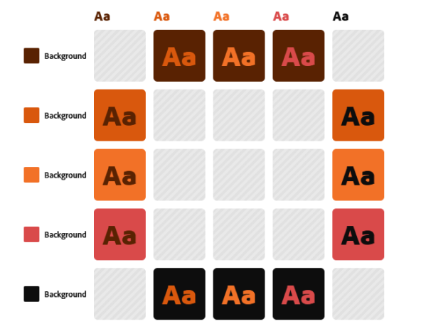
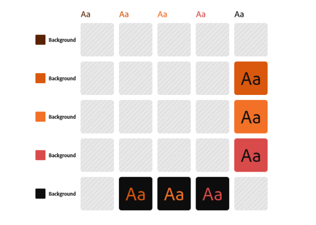
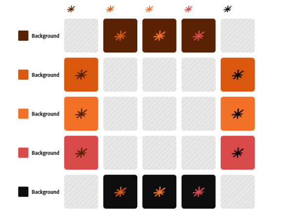
Third and last redesign after feedback from the last mentoring. The windows UI idea was widely rejected, while the cyber terminal aesthetic was seen as more cohesive, yet lacking. With this last attempt at redesigning the UI I started from scratch choosing a color palette based off Chip. One being the colorful palette and the other being a complementary contrast palette. These colors were analysed for various issues like contrast, if they work together, and color blindness conflicts.
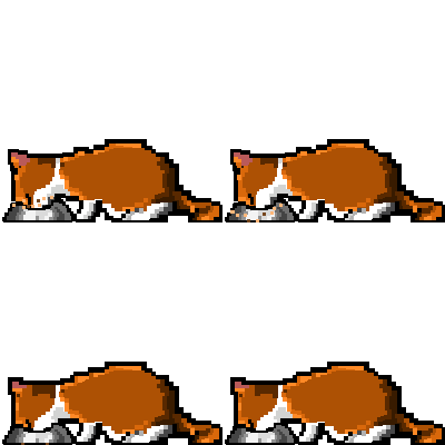
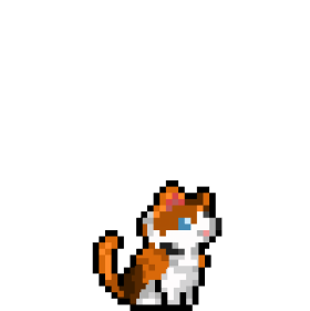
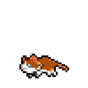
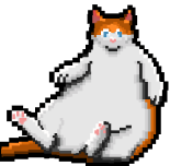
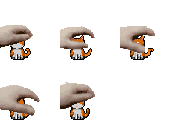
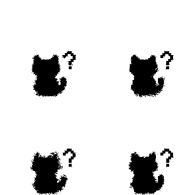
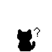
Disbelief/Confusion
First attempts at emotions
Final emotions, not all were used
Confusion
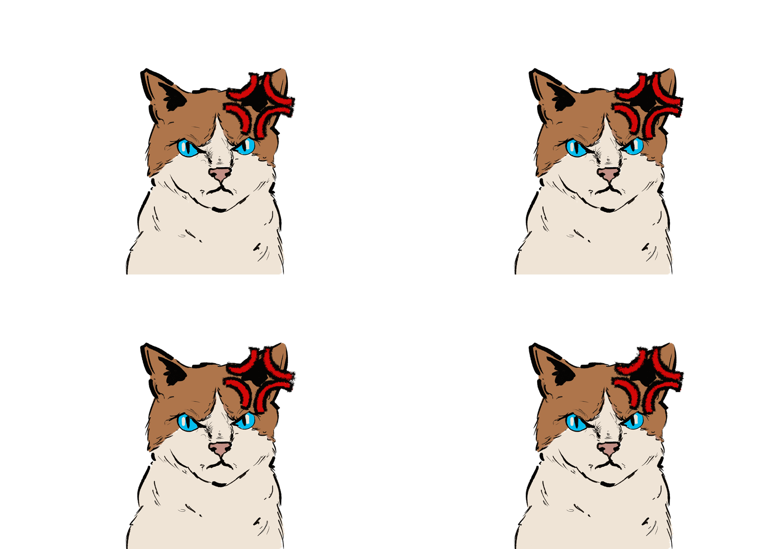
Anger/Shock
Mad
Fear
Happy/Pleased
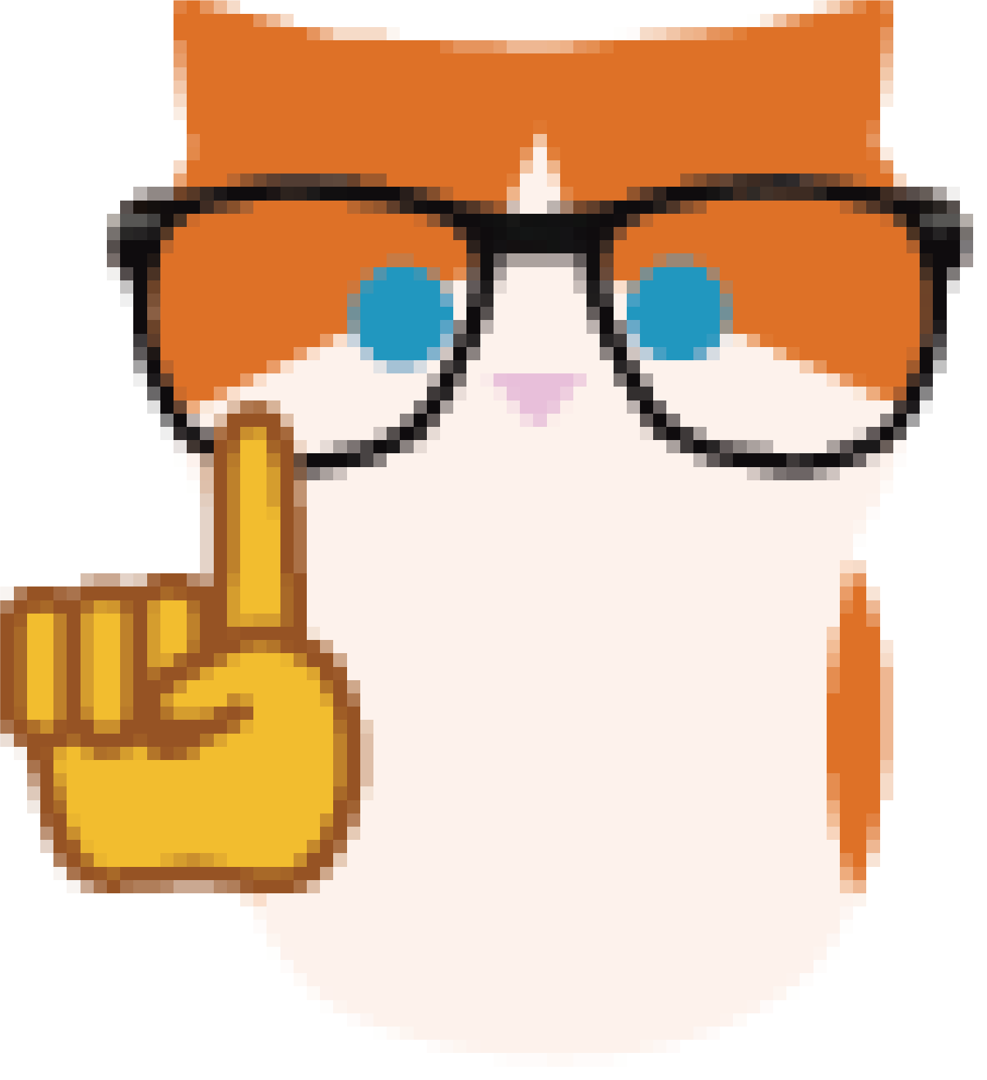
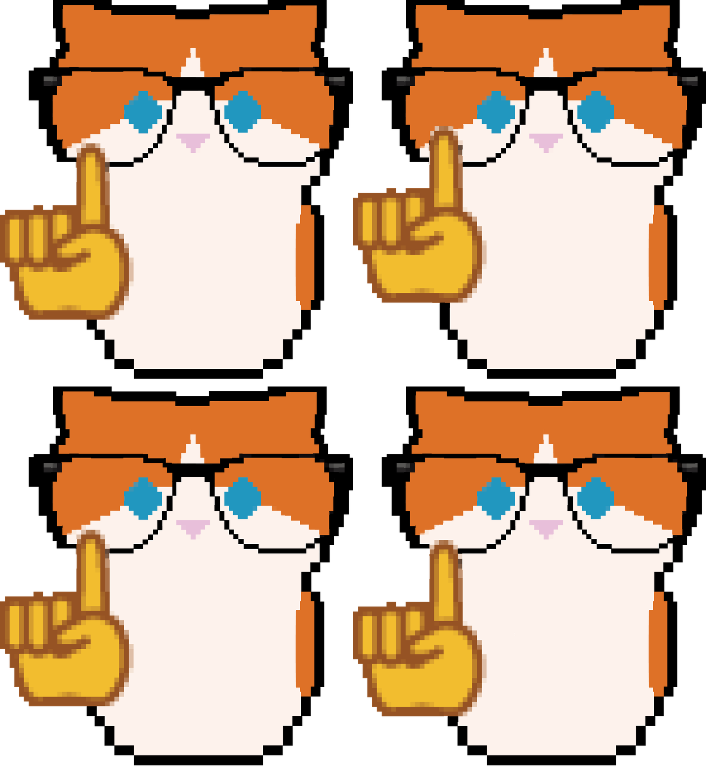
Nerd face
Congratulations


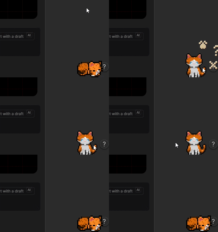
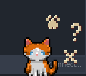
Radial menu triggered on cat click. Buttons shown in idle and clicked state
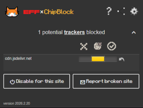
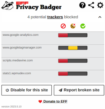
Default PB window
First changes on the UI
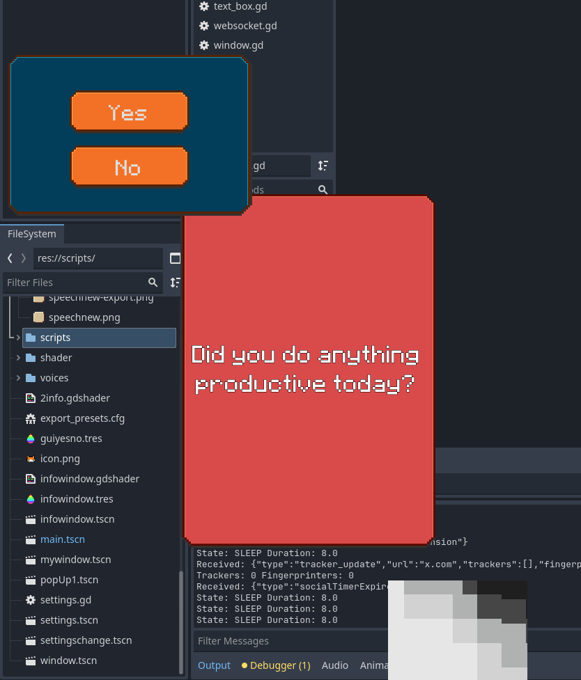
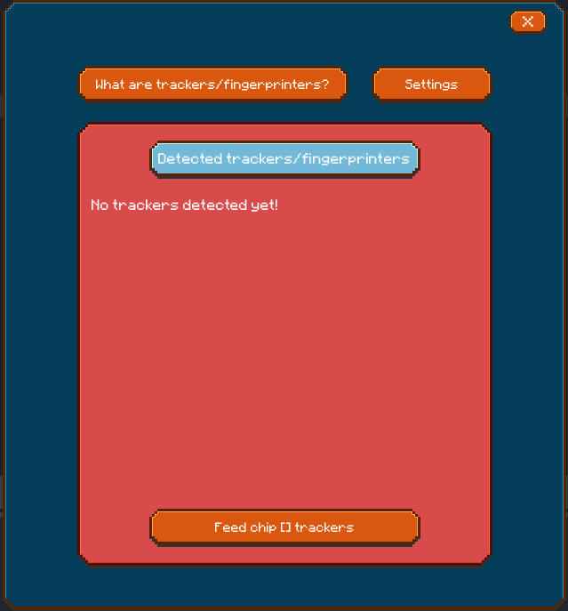
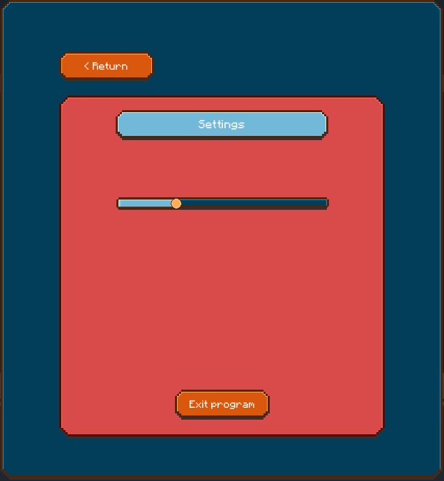
Final UI design
Info box on the left is windows vista, the grey dialogue box is windows 98, the black button box below is windows 10
Plug-in design with the windows UI
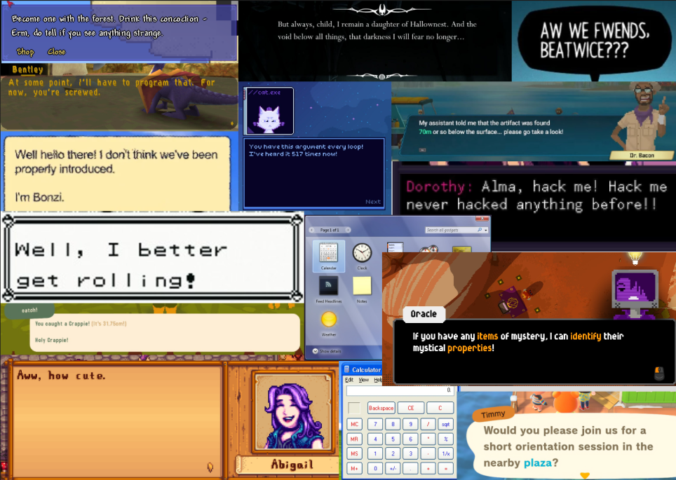
Cyber terminal idea inspired by games I played, heavy use of code like elements like the chip.exe name and the binary code in the back
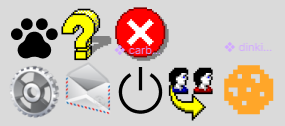
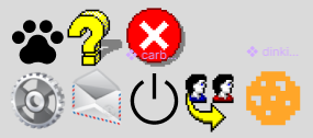
Alternative icons mixing many different designs from previous eras
Colorful palette
Contrast palette
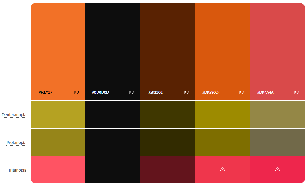
Tests for various color blindness, only noticeably conflict is with tritanopia
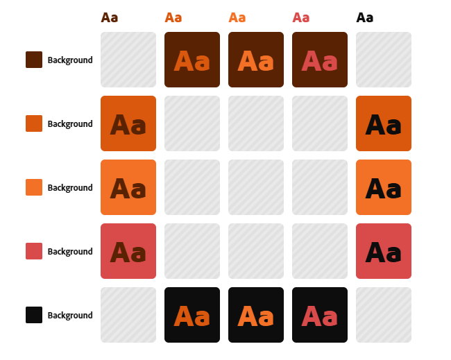
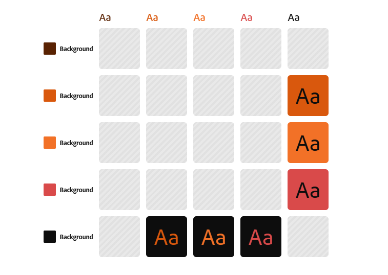
Tests for contrast, what works with which colors and in what context
First experiments on figma
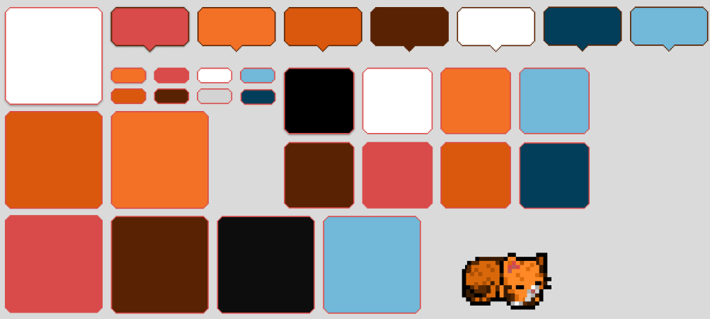
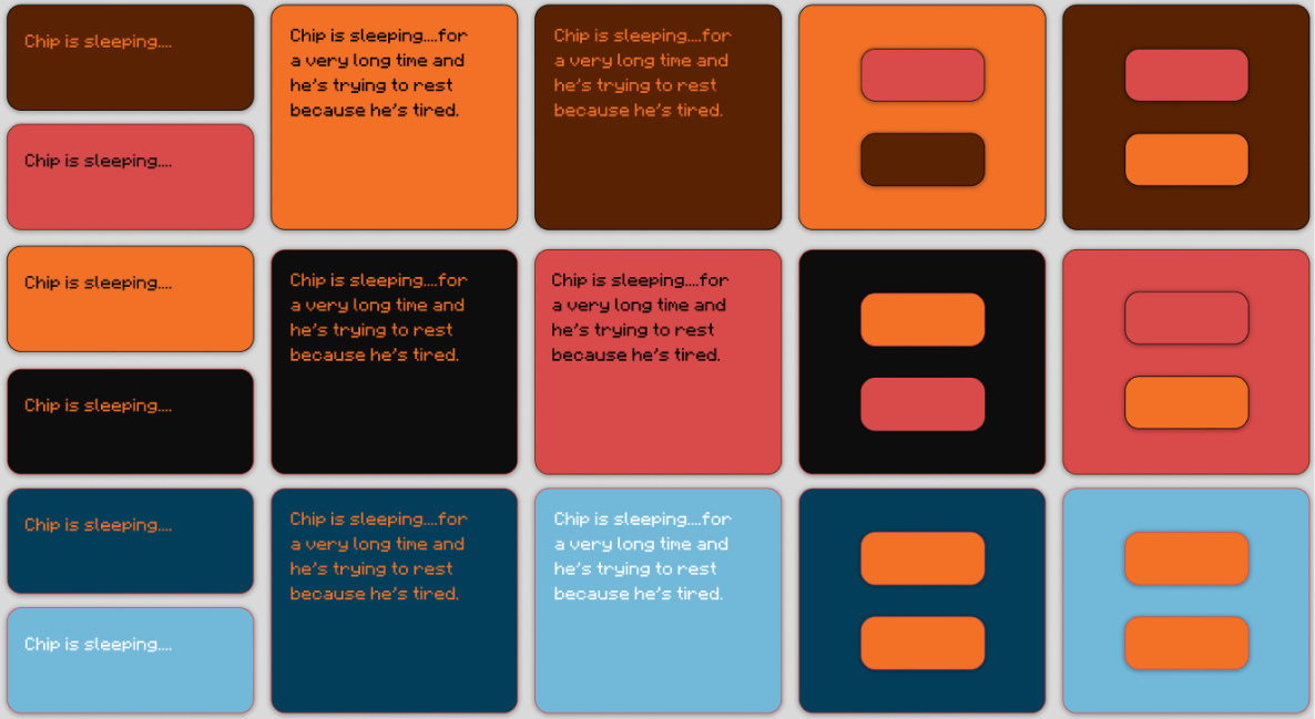
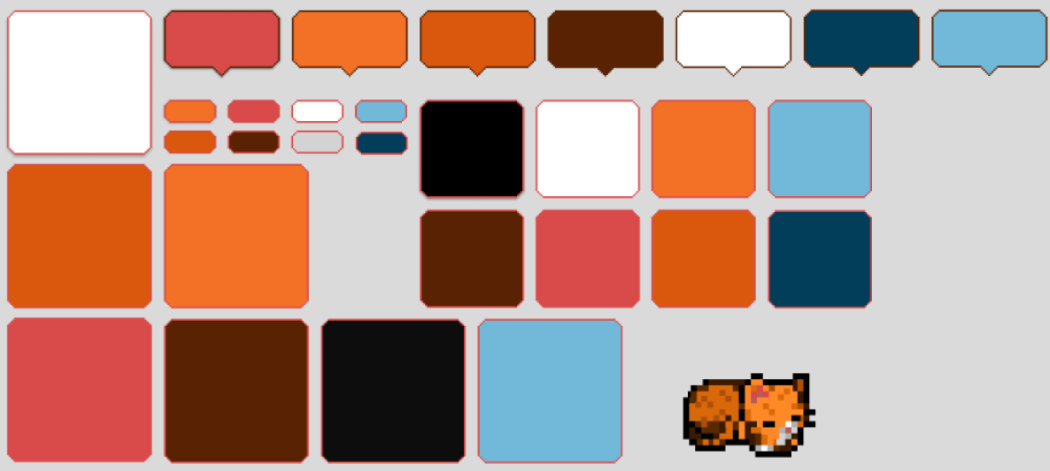
Pixel art renditions of the GUI in the same colors
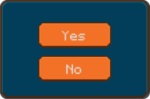
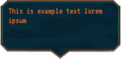
Dialogue box
Button Box
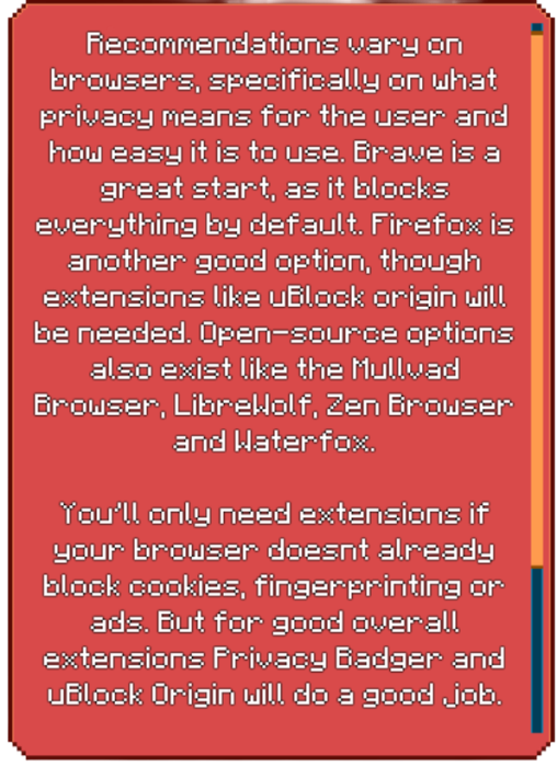
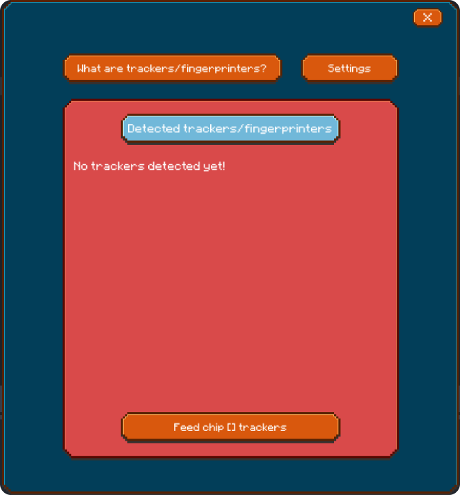
Information box
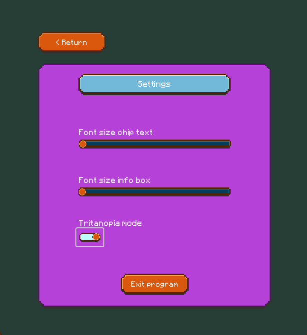
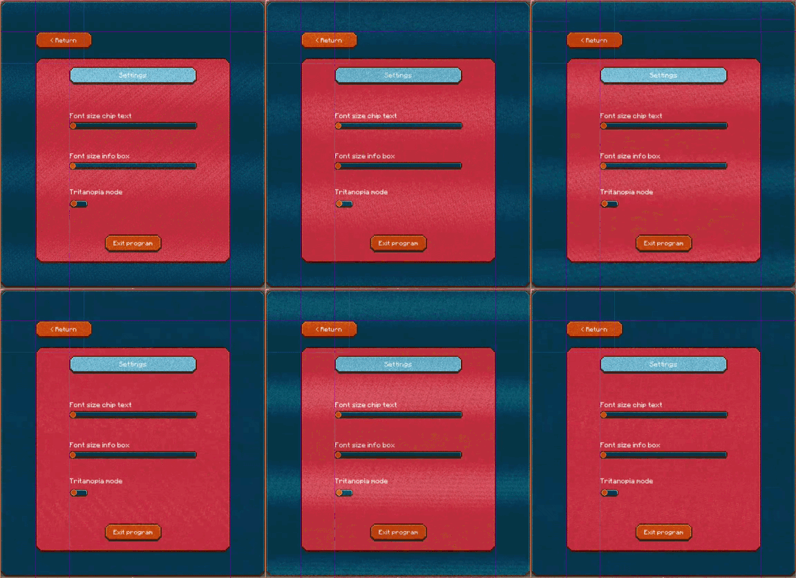
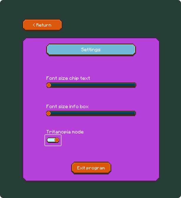
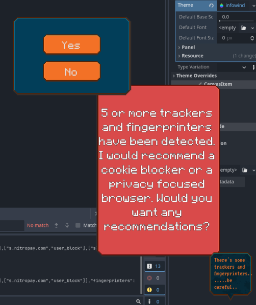
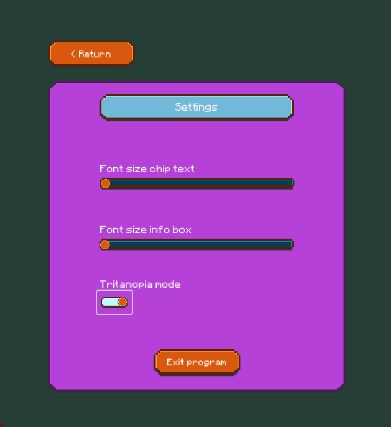
The final step with the UI was to make it accessible for tritanopia, as it was the only color blindness with potential issues. The fix here was to separate the orange from the red much more clearly, for people to be able to differentiate these colors. With the red being turned into a dark purple, it should be seen as a dark and muddy pink for someone with tritanopia.
Based off the colors chosen I began experimenting with various combinations, quickly figuring out which ones work together the best. After the base experiments on figma I created the GUI on Asperite as pixel art in these various colors.
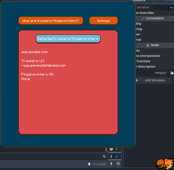
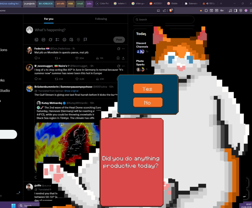
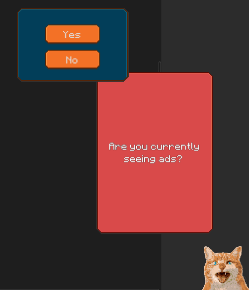
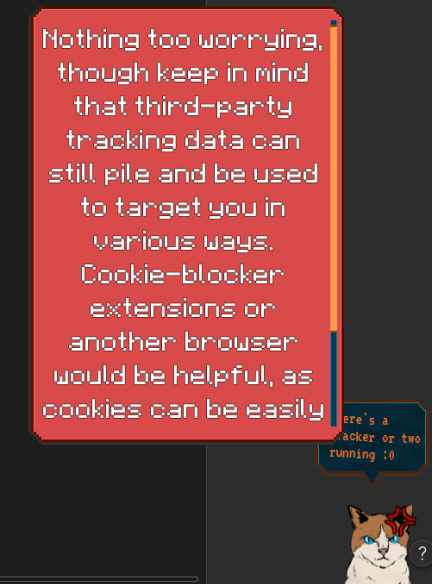
After many attempts to find the right combinations I came to use the blue hues, the red and the orange, with the idea being of utilising these colors in consistent ways to after some use should feel intuitive. The blues are used as background to highlight its contents, the red is used for the informational layer of the app showcasing settings or warnings, and the orange is the interactive layer that a user can press, slide or scroll with. Each box was further detailed with outlines, shadows and highlights to add dimension to them, with the dialogue box being given slight texture to set it apart from the rest of the GUI.




.png)